Saturday 30 December 2017

Wallace Seymour Artists' Watercolours

It's my final post for 2017 as it is already 31st December in Australia. I have many ideas for future posts, including hopefully completing my project to post the full range of every professional watercolour available in the world! Maybe I'll achieve that one in 2018, and add all the swatches to my website. Here's a newish addition.

Wallace Seymour, formerly Pip Seymour but now renamed after his partner Rebecca Wallace, are relatively new to the watercolour world, from the UK. For their Artists Watercolours range they focus on the very traditional pigments - they are largely cobalts, cadmiums, earth pigments and a couple of phthalos, rather than the newer quinacridones, pyrrols and perylenes. They are formulated with 'a special emulsion of honey and Kordofan Gum Arabic'. They are lovely to paint with - very beautiful with wonderful granulation.

They make a range of 20ml tubes colours called Vintage Watercolours which I will post about separately, but this is a completely different range of full pan colours called Artists' Watercolours that I will look at here. Unlike many brands, the tube colours are far from being the same pigments, names or handling characteristics as the pan colours.

There is also a set of 4 called The Four Humours, which I will show as a separate post here, and some other Ancient Drawing Materials that I haven't tried. Wallace Seymour also make Oils and acrylics but I haven't tried them at all.

The full pan Artists Watercolours are available in Australia from Pigment Lab in Newtown. I haven't tried all of them yet, but will show some here and update over time. They granulate beautifully and rewet with ease.


The full range of 58 Artists Watercolours full pans can be seen here.

There are many beautiful cadmium colours in this range, which I appreciate, even though I don't tend to use them very often. They are excellent pigments with gorgeous granulation but can be too opaque for working with pen lines as I often do. However in this tradition range they really dominate and are excellent versions of cadmium colours.


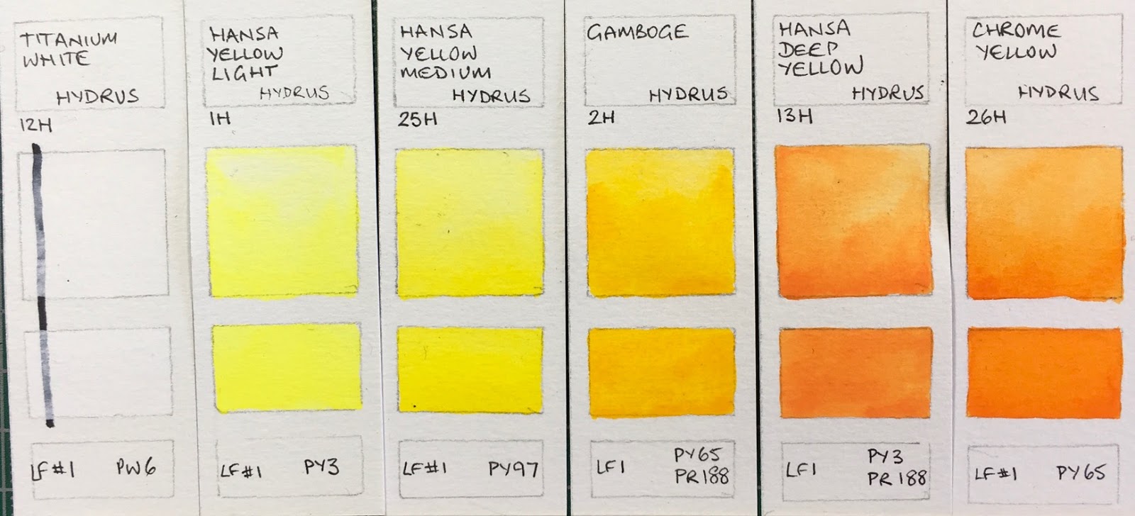
I'll was curious to try the Body Colour and see how opaque it is. Nickel Titanium Yellow is a very weak pigment and not one I bother with. Permanent Yellow Light is a good choice for a more transparent lemon yellow.
Wallace Seymour Extra Fine Artists' Watercolours - Body Colour solid white, Nickel titanium Yellow (not shown), Permanent Yellow Light, Cadmium Yellow Lemon (not shown), Cadmium Yellow Light.


 Many more to try here...
Wallace Seymour Extra Fine Artists' Watercolours - Cadmium Yellow Middle, Cobalt Yellow Aureolin (not shown), Cadmium Yellow Deep (not shown), Cadmium Orange Light (not shown), Cadmium Orange Deep (not shown).


Cadmium Red Light is a lovely warm red. It is a lovely rich version of Alizarin Crimson but being made from the traditional PR83 it will fade with exposure to light. I'd like to see a modern alternative added here, such as PR264. However in a sketchbook this is a very rich version to try.
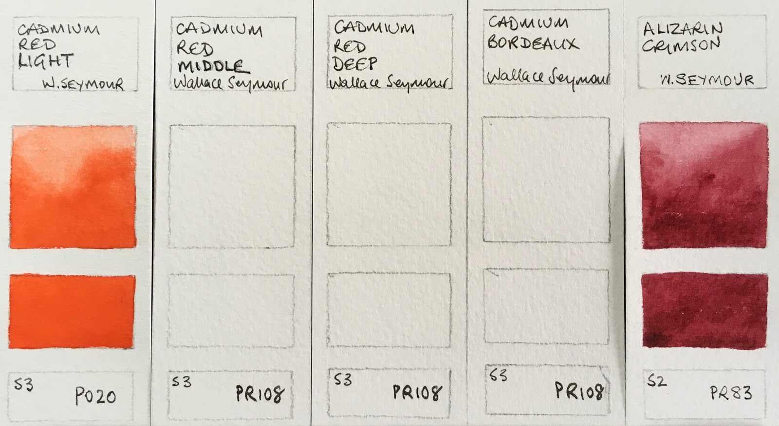
Wallace Seymour Extra Fine Artists' Watercolours - Cadmium Red Light, Cadmium Red Middle (not shown), Cadmium Red Deep (not shown), Cadmium Bordeaux (not shown), Alizarin Crimson.

Quinacridone Magenta is PV19 and often known as Quinacridone Rose or Permanent Rose - a lovely pigment and great primary red. This was weaker than I expected but apparently it gets stronger as you use the pan... This is the only Quinacridone colour in the range. There are many interesting and granulating purples to try...
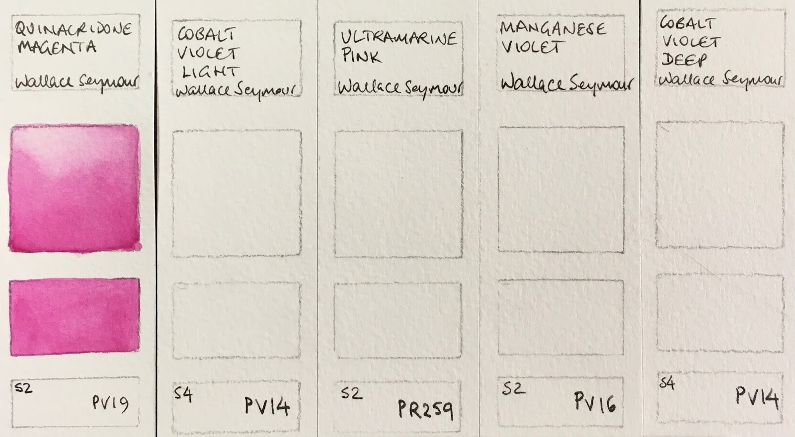
Wallace Seymour Extra Fine Artists' Watercolours - Quinacridone Magenta, Cobalt Violet Light (not shown), Ultramarine Pink (not shown), Manganese Violet (not shown), Cobalt Violet Deep (not shown).

The Ultramarine and cobalt colours are also gorgeous. I love the Cobalt Blue Middle (also known as Cerulean Chromium in Daniel Smith or Cobalt Cerulean in Schmincke - a gorgeous colour) and Cobalt Turquoise (see below). The Ultramarine Blue Deep and Cobalt Blue Middle are gorgeous as a basic pair of blues.
Wallace Seymour Extra Fine Artists' Watercolours - Ultramarine Red (not shown), Ultramarine Blue Deep, Cobalt Blue Deep (not shown), Cobalt Blue Light (not shown), Cobalt Blue Middle.

Many to try here too.
Wallace Seymour Extra Fine Artists' Watercolours - Cerulean Blue (not shown), Paris Blue - Prussian Blue (not shown), Indigo (Hue) (not shown), Seymour Blue (not shown), Phthalocyanine Blue.

I really love PB36 whether as the bluer version or this more turquoise version. Phthalo Green is always a useful mixing colour. I tested the green on the right in Pigment Lab store and didn't see the pigment information - it looks like cobalt and cadmium colours so I assume it is Cobalt Green Light.
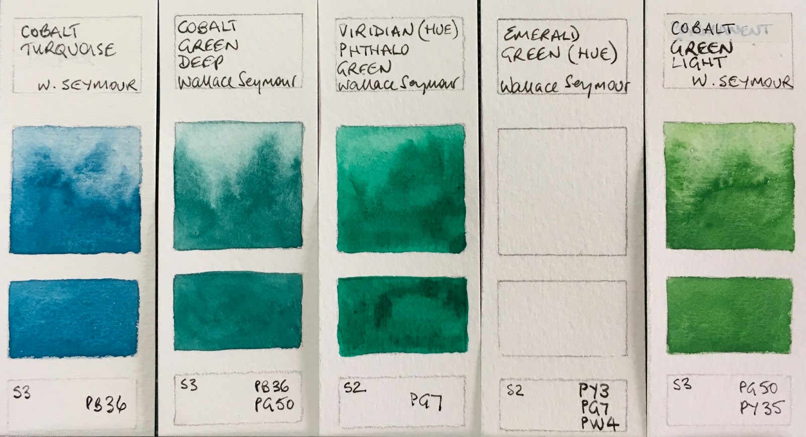
Wallace Seymour Extra Fine Artists' Watercolours - Cobalt Turquoise, Cobalt Green Deep, Viridian (Hue) Phthalo Green, Emerald Green (Hue) (not shown), Cobalt Green Light (I think - this was tested in a shop!)

PG23 is never a strong tinting pigment but has interesting granulation.
Wallace Seymour Extra Fine Artists' Watercolours - Permanent Green Middle (not shown), Permanent Green Very Light (not shown), Chrome Oxide Green (not shown), Verona Green Earth, Bohemian Green Earth (not shown).

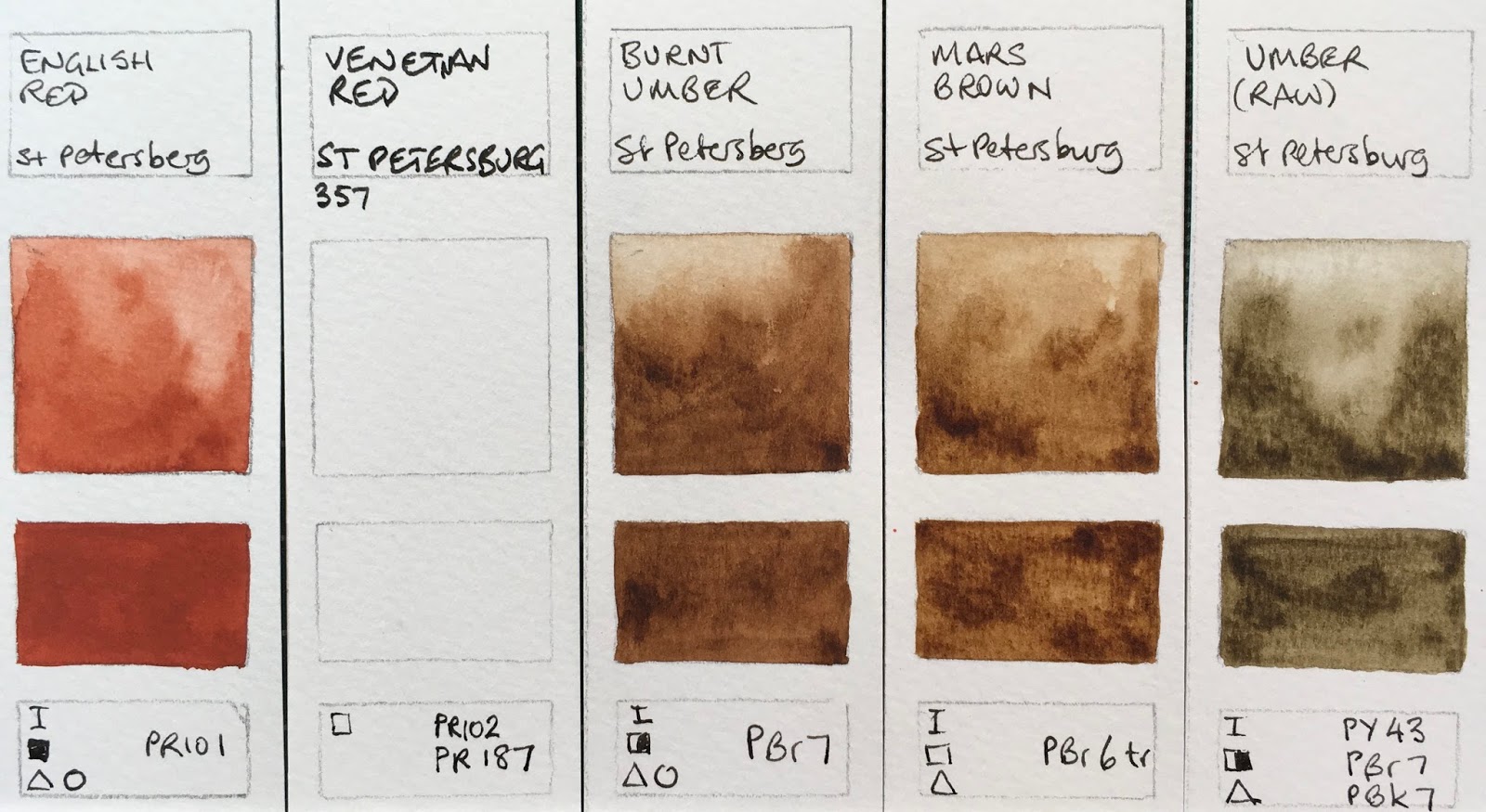
I like the single pigment earth colours best. I also like it when the 'correct' pigments are used - PBr7 for raw Sienna, PY43 for yellow ochre, as seen here.The earth pigments are really lovely in this range. Varied in hue and interesting in characteristics.
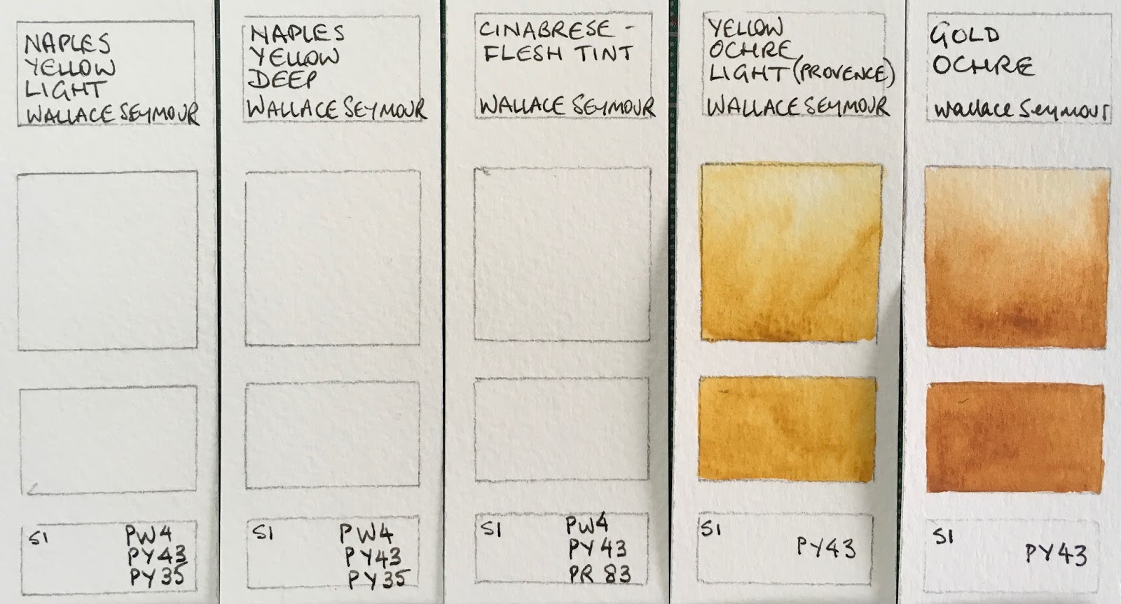
Wallace Seymour Extra Fine Artists' Watercolours - Naples Yellow Light (not shown), Naples Yellow Deep (not shown), Cinabrese - Flesh Tint (not shown), Yellow Ochre Light (Provence), Gold Ochre.

I am always glad to see Raw Sienna and Burnt Sienna made from PBr7 as they should be. The raw is heated to produce the burnt sienna. Pozzuolii earth is also a lively earth red.
Wallace Seymour Extra Fine Artists' Watercolours - Brown Ochre (not shown), Burnt Yellow Ochre, Raw Sienna, Burnt Sienna, Pozzuolii Earth.

It's an interesting and different version of Indian Red than most - rather lovely. Burnt and Raw Umber are also made from PBr7, the raw heated to produce the burnt.
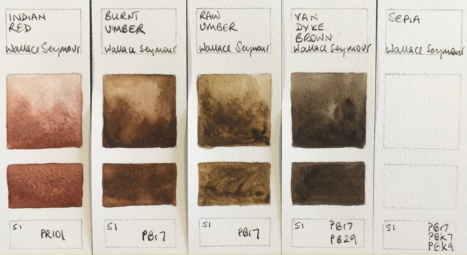
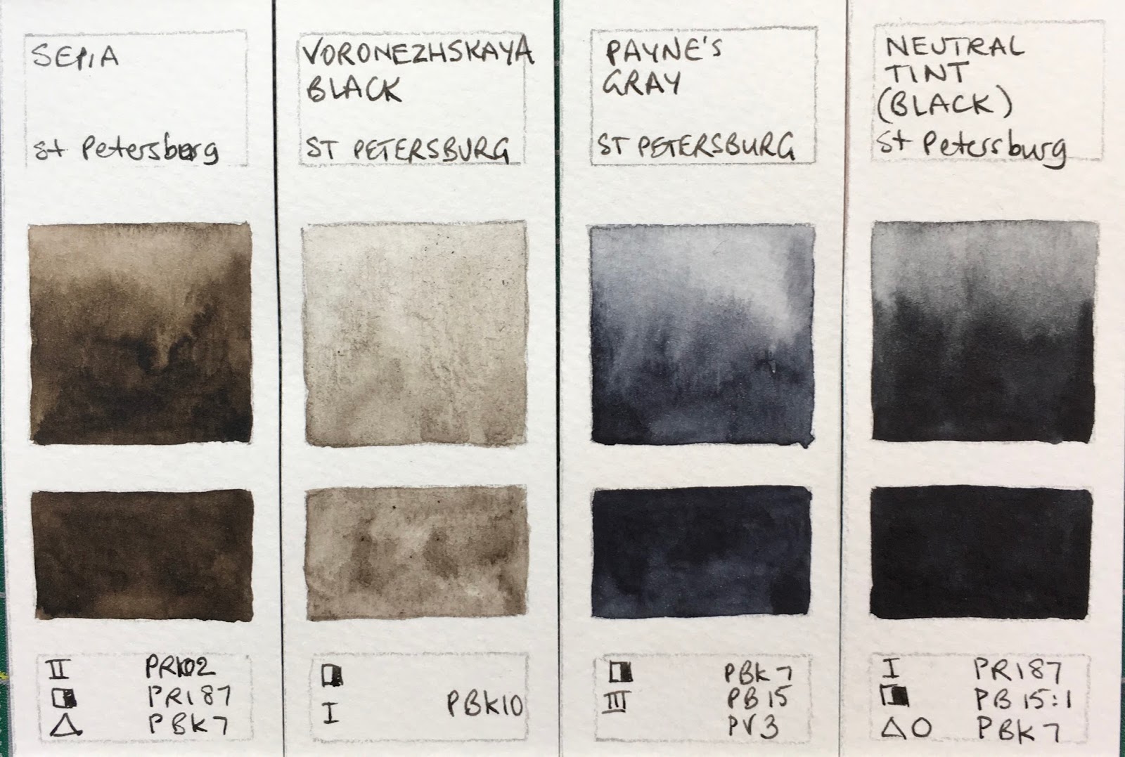
Wallace Seymour Extra Fine Artists' Watercolours - Indian Red, Burnt Umber, Raw Umber, Van Dyke Brown, Sepia (not shown).

Payne's Grey Light wins the (dubious) prize for the most pigments I have eve seen in a watercolour - 7!!! I haven't tried it yet, but one is PR83 which is the fugitive Alizarin Crimson...
Wallace Seymour Extra Fine Artists' Watercolours - Violet Grey (not shown), Payne's Grey Light (not shown), Payne's Grey, Ivory Black (not shown).


There are a lot more to try before I can show the full range, but the pigment information is not included on the website (though has now been added to the labelling in 2018) so I will add that here for all the colours. Payne's Grey Light wins the prize for the most pigments in any watercolour I have tried - 7!! But it also includes PR83 which is the fugitive Alizarin Crimson pigment.


Body Colour - Solid White PW 6 PW 5 Series 1 

Permanent Yellow Light PY 3 Series 1 (shown above)

Cobalt Yellow (Aureolin) PY 40 Series 4 

Nickel Titanium Yellow PY 53 Series 2 

Cadmium Yellow Lemon PY 35 Series 3 

Cadmium Yellow Light PY 35 Series 3 (shown above)

Cadmium Yellow Middle PY 35 Series 3 

Cadmium Yellow Deep PO 20 Series 3 

Cadmium Orange Light PO 20 Series 3

Cadmium Orange Deep PO 20 Series 3 

Cadmium Red Light PO 20  Series 3 (shown above)

Cadmium Red Middle PR 108  Series 3 

Cadmium Red Deep PR 108 Series 3 

Cadmium Bordeaux PR 108 Series 3 

Alizarin Crimson PR 83 Series 2 (shown) 

Quinacridone Magenta PV 19  Series 2 (shown above)

Naples Yellow Light PW 4 PY 43 PY 35 Series 1 

Naples Yellow Deep PW 4 PY 43 PY 35 Series 1 

Cinabrese - flesh tint PW 4 PY 43 PR 83 Series 1 

Yellow Ochre Light PY 43 Series 1 (shown above)

Gold Ochre PY 43 Series 1

Brown Ochre PBr 7 Series 1 

Burnt Yellow Ochre PY 43 Series 2 

Raw Sienna PBr 7 Series 1 (shown above)

Burnt Sienna PBr 7 Series 1 (shown above)

Pozzuolii Earth PR 101 Series1 (shown above)

Indian Red PR 101 Series 1 (shown above)

Raw Umber PBr 7 Series 1 (shown above)

Burnt Umber PBr 7 Series 1 (shown above)

Van Dyke Brown PBr 7 PB 29 Series 1 

Sepia PBr 7 PBk 7 PBk 9  Series 1 

Verona Green Earth PBr 7 PG 7  Series 1 (shown above)

Bohemian Green Earth PG 23 Series 2

Permanent Green Very Light PY 3 PG 7 Series 2 

Permanent Green Middle PY3 PG 7 Series 2 

Emerald Green (hue) PY3 PG 7 PW 4 Series 2 

Viridian (hue) - Phthalo Green PG 7 Series 2 (shown above)

Chrome Oxide Green PG 17 Series 2 

Cobalt Green Light PG 50 PY 35 Series 3 (shown above?)

Cobalt green Deep PB 36 PG 50 Series 3 (shown above)

Cobalt Turquoise PB 36 series 3 (shown above)

Cerulean Blue PB 35 series 4

Seymour Blue PB 15 PW 4 Series 1 
Cobalt Blue Light PB 28 PB 36  Series 3

Cobalt Blue Middle PB 36 PB36 Series 3
Cobalt Blue Deep PB 28 Series 3
Ultramarine Blue Deep PB 29 Series 2

Phthalocyanine Blue PB 15 Series 2
Paris blue - Prussian Blue PB 27 Series 2
Indigo (hue) PB29PB15 PBk7 PBk9 Series 2
Cobalt violet Light PV 14 Series 4
Cobalt violet Deep PV 14 Series 4
Manganese Violet PV 16 Series 2
Ultramarine Pink PR 259 Series 2
Ultramarine Red PV 15 Series 2
Violet Grey PG7 PW4 PB29 PV23 Series 2
Payne's GreyLight PW 4 PW 6 PB 27 PBk 7 PBk 9 PR 83 PV 15 (seven pigments!!!) Series 1 
Payne's Grey PB 27 PBk 7 PBk 9 PR 83 PV15 Series 1
Ivory Black PBk 7 PBk 9 Series 1


Happy painting and the very best wishes for 2018 :-)
See also - 
Art Spectrum watercolours here
Blockx full range of Watercolours here
Daler Rowney Artists' Watercolours here
Daniel Smith new colours 2017 here
Daniel Smith full range here
Da Vinci range here
Dr PH Hydrus Watercolours here
Holbein Watercolours here
Lukas watercolours here
M.Graham watercolours here
MaimeriBlu full range here
Mission Blue full range here
Old Holland full range here
QoR watercolours here
Rembrandt Watercolours here
Schmincke new colours 2017 here
Schmincke full range here
Sennelier watercolours here
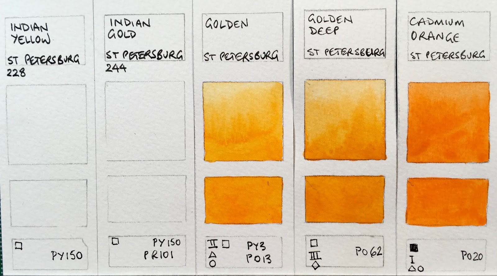
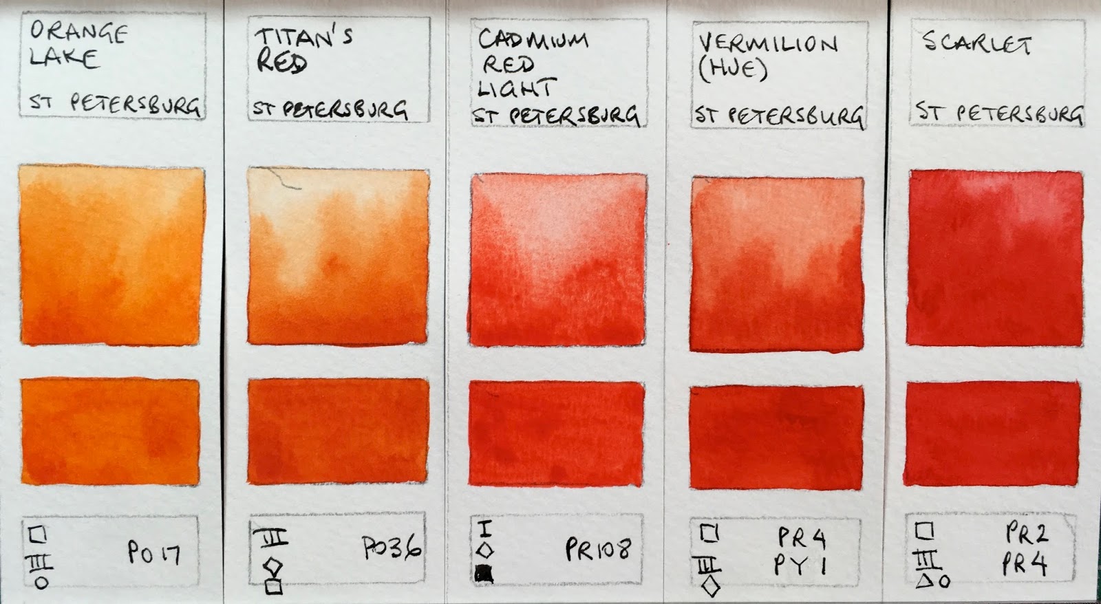
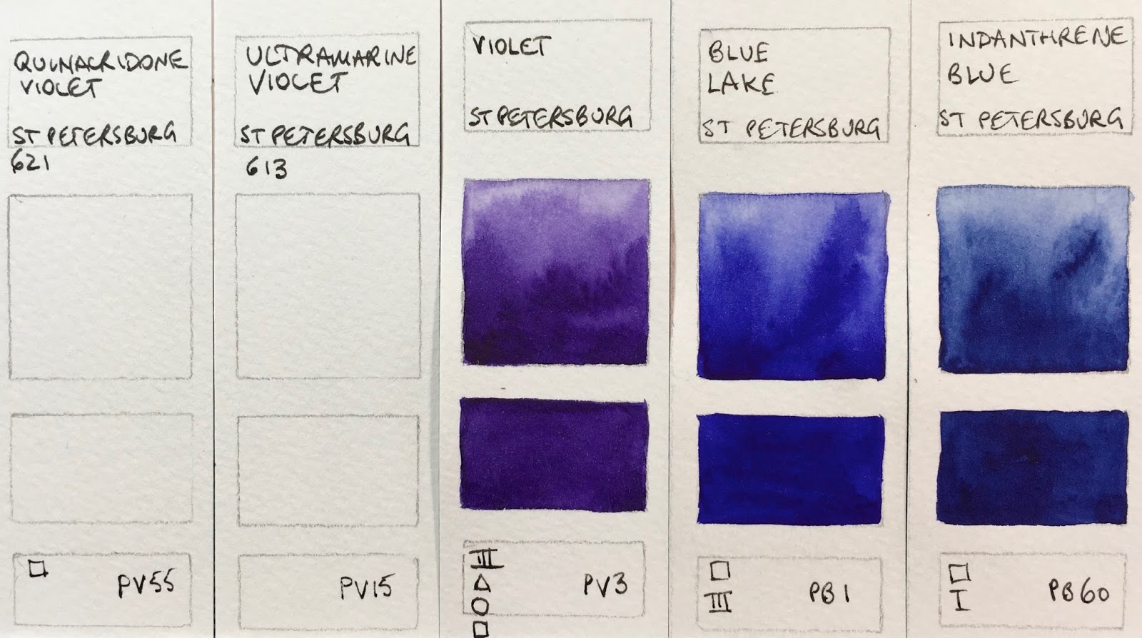
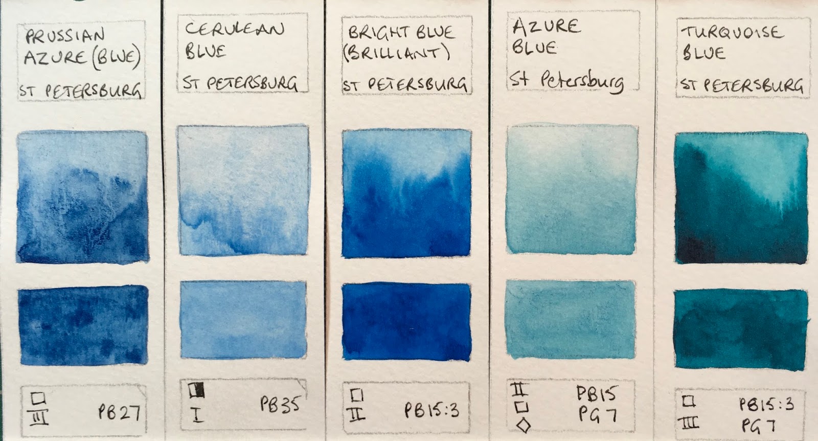
St Petersburg Watercolours here
Wallace Seymour Artists Watercolours here
White Nights watercolours here
Winsor & Newton Full range here

(updated March 2018)

Thursday 28 December 2017

Quinacridone Gold Hues

Quinacridone Gold could be considered a non-essential colour, but it very quickly became one of my personal go-to favourites when I first tried the Daniel Smith PO49 version back in about 1995. I think it was the first company to produce the colour, and I loved not only the way it mixed, but also the gorgeous glow it could add to a painting. I've also tried a PO49 version from Winsor & Newton, but otherwise only hues from other manufactures.

It is brighter than most earth yellows, but more neutralised that most warm yellows so is a neutralised warm yellow. It's perfect for making the gorgeous dull greens of the Australian landscape.

This year saw the end of the world's PO49 supply that Daniel Smith bought up about 17 years ago, when the car industry lost interest in the beautiful pigment and production ceased. The last batch was produced in September. Though I did see some available in dry pigment form in New York...(see edit below)

Since PO49 has run out, I thought I'd post up a sample of different versions for comparison.

The first has the yellower Nickel Quinacridone Gold from M.Graham, followed by the new (2017) Schmincke Quinacridone Gold Hue and the QoR Quinacridone Gold. PY150 is a perfect base for this colour hue and it appears in all versions.

M.Graham Nickel Quinacridone Gold, Schmincke Quinacridone Gold Hue, QoR Quinacridone Gold.

Next are Quinacridone Gold Hue from Daniel Smith introduced in 2015 for 5ml tubes and sticks, and now used in 15ml tubes. This hue was used in the mixes (including Sap green and Undersea green) from that time instead of PO49. Next shown are the genuine PO49 from Daniel Smith and the genuine PO49 from Winsor & Newton (also no longer available).

Daneil Smith Quinacridone Gold, Daniel smith Quinacridone Gold (PO49), Winsor & Newton Quinacridone Gold (PO49)

And finally the Winsor & Newton three pigment hue which looks ok in this sample but is often very dull, the three pigment Sennelier hue and the deeper and more orange Da Vinci hue.

Winsor & Newton Quinacridone Gold, Sennelier Quinacridone gold, Da Vinci Quinacridone Gold.

They are all very similar, though the W&N is less bright due to the PV19 and the Da Vinci is deeper - almost like a PO48 Quin Gold deep. As always, it's hard to show on the screen.

My favourite mix is PY150 plus PR101 (DS transparent red oxide, DS Burnt Sienna Light or W&N burnt sienna) that Schmincke uses, though PR206, PO48 and also work.

The world hasn't ended, and just as we survived the end of PY153 and other gorgeous pigments, we'll survive the end of this one (though I admit I started hoarding tubes of PO49 a while ago....)

I'll also show these pictures on Instagram (Janeblundellart) where they may look slightly different.


Edit January 2018 - The dry samples I had noticed (mentioned above) were from Guerra Pigments in New York. Thanks to RiverdaleWatercolor who commented below, here is a sample of the Guerra PO49 pigment compared with Daniel Smith PO49. Apparently this took some hours to mull to get smooth enough for watercolour, but there is also a dispersion available which may be more suitable for home made watercolours. It certainly looks beautiful on the screen if you click on the link.

Daniel Smith PO49 (left) compared with Guerra Pigments PO49 (right).
As far as mixing is concerned, the Guerra pigment behaved more like a raw sienna.


Edit March 2018 - Riverdale watercolours sent me a sample of her hand made Quinacridone Gold made with the Guerra dry pigment and it's quite something! Not what I expect for PO49, but very beautiful with extreme granulation. It is almost a burnt sienna colour.


If you are using my ultimate mixing set, you can also create a very nice Quin Gold hue by mixing hansa yellow medium with burnt Sienna. However I think the DS hue is close enough to still be a useful colour in the palette - it will still mix gorgeous greens and provide a beautiful warm glow.

Happy painting!


Tuesday 26 December 2017

St Petersburg watercolours

Ultramarine
St Petersburg by Yarka label
Ultramarine
Nevskaya Palitra label
.

White Nights watercolours in are made in Russia by Nevskaya Palitra, who also make a cheaper student range called 'Sonnet' and another range called 'Ladoga'.

The naming gets confusing though, as White Nights are called 'St Petersburg by Yarka' in the US where they are rebranded by Jack Richeson & Co Inc, but as far as I am aware, the colours and pigments of the different labels are the same. The full pans of both White Nights and St Petersburg are embossed with 'St Petersburg' so they would seem to be simply different names for the same range, with White Nights being the name in Russia and Europe and St Petersburg better known in the USA.

I received 24 of the White Nights colours in 2015 and wrote about them here.

Richeson & Co sent me the full range of St Petersburg colours and I painted out all those and will show them here. All are identical, except for Cerulean which looked and behaved differently in each range, but that could simply be a different batch. Another 9 colours were added to the White Nights range the Northern Spring this year, which I don't have, but have created a swatch card for each of them, including the pigment information.

These are the most affordable 'professional' watercolours available, priced in some markets all the same and in others in two series. In Australia they are just AU$4.95 each. However I do need to qualify that I would suggest caution if using these for works that will be framed and exhibited as there are many fugitive pigments in the lists that may fade on exposure to sunlight. While they use genuine pigments, some are not as strong as higher cost watercolours and they seem to contain some binders or fillers.

For those starting out, working in a sketchbook or just playing with a new medium, buying for children or class sets, they are a very simple and affordable way to start - better than using student grade colours - without having the problem of what to do with the tubes, or how to make up palettes or pans. And since they are all full pans, there is good brush access and plenty of colour to paint with.

Note - twelve of the colours are also available as tubes. The full information can be found here.

Here are the colours, colour matched as close as I can, but as always matching the yellow/oranges and oranges and some reds is a difficult job.


Most of the yellows look fine, and PY1 looks lovely - it's interesting to see PY1 and I don't think I know of any other versions of it in watercolour. I'd tend to suggest trying that or ASTM I Cadmium Yellow Medium in this range as it is not as opaque as it can be - not so opaque that they cover drawn lines completely -  or Lemon for a definite cool yellow hue.

Yarka: St Petersburg watercolours - Zinc White, Lemon, Cadmium Lemon, Hansa Yellow, Cadmium Yellow Medium.

It's always difficult to show yellow oranges and orange reds accurately. Indian Yellow and Indian Gold were released by White Nights in the Northern Spring 2017 so I am guessing they will also appear in St Petersburg. Made with PY150, Indian Yellow should be a very transparent mid yellow - a good primary yellow choice. Adding PR101 will make it warmer like a quinacridone gold hue. Golden and Golden Deep are really verging on orange rather than yellow.
Yarka: St Petersburg watercolours - Indian Yellow (not shown), Indian Gold (not shown), Golden, Golden Deep,
Cadmium Orange.

Orange Lake is very bright and Titian's Red (actaully just called Titian's on the packaging) is a lovely rich orange and the other warm reds are very clean and bright.  Cadmium Red Light is made with PR108 - a reliable warm red pigment. Scarlet is a mid fire engine red.
Yarka: St Petersburg watercolours - Orange Lake, Titian's Red, Cadmium Red Light, Vermilion (Hue), Scarlet.

I'd be interested to see the new PV19 colours as I suspect they will be excellent primary red and violet hues, with better lightfastness than the current crimson and rose colours.

Yarka: St Petersburg watercolours - Ruby, Madder Lake Red Light, Carmine (Hue), Quinacridone Red,
Quinacridone Violet Rose.

PR122 is most often called Quinacridone Magenta and is an excellent choice as a primary red in a limited palette. I've not seen PV2 anywhere else.
Yarka: St Petersburg watercolours - Quinacridone Rose, Rose, Quinacridone Lilac, Claret, Violet-Rose.

PV55 is the pigment used in Daniel Smith Quinacridone Purple and Ultramarine Violet is usually a gently granulating pigment. Hopefully I'll be able to add these samples at some stage. I've never seen PV3 (Violet) or PB1 (Blue Lake) in other ranges. Both are beautiful, but not very lightfast.
Yarka: St Petersburg watercolours - Quinacridone Violet (not shown), Ultramarine Violet (not shown), Violet,
Blue Lake, Indanthrone Blue.

It's a lovely version of ultramarine - an essential warm blue watercolour as far as I am concerned -  being useful for mixing, for skies and on its own. The new blue would probably look like a phthalo blue red shade.
Yarka: St Petersburg watercolours - Ultramarine, Cobalt Blue, Blue (not shown), Blue (Russian), Indigo.

The Cerulean is not a strong as I'd like to see, and interestingly is slightly different from the White Nights Cerulean Blue, though the same pigment. I prefer PB36 Cerulean to the generally warmer  PB35, but it is still a useful non-staining cool blue for painting skies. Bright Blue is normally known as phthalo blue - this is the green shade - a useful cool blue.
Yarka: St Petersburg watercolours - Prussian Azure (Blue), Ceruleum Blue, Bright Blue (Brilliant), Asure Blue, Turquoise Blue.

Emerald Green is usually known as phthalo green - a very useful mixing green, though I'd very very rarely use it alone. Russian Green is a lovely colour, though not especially light-fast so best in the protection of a sketchbook. The new Sap Green is made from chrome green and a transparent mid yellow so I'd expect it to be granulating and rather olive.
Yarka: St Petersburg watercoloursEmerald Green, Green Original, Green Light, Green (Russian), Sap Green (not shown).

There are some interesting mixed greens in this range. Either Green Earth or Olive Green might be a good convenience foliage green. Green Light is better knows as phthalo green yellow shade and oxide of chromium is a rather fascinating granulating pigment.
Yarka: St Petersburg watercoloursOxide of Chromium, Yellowish Green, Green Earth, Olive Green, Yellow Ochre.

I like the earth colours Raw Sienna and Burnt Sienna best in this range as they are single pigment earth colours - always my preference if possible. The Red Ochre is interesting too, though not essential. I'd be interested to know if anyone else has managed to get a better colour from the Shakhnazarskaya Red?
Yarka: St Petersburg watercolours - Naples Yellow, Raw Sienna, Red Ochre, Shakhnazarskaya Red, Burnt Sienna.

I like to see raw umber as a cool deep brown, but prefer it as a single pigment colour. Venetian Red is usually made with PR101.
Yarka: St Petersburg watercolours - English Red, Venetian Red (not shown), Burnt Umber, Mars Brown, Umber (Raw)

And the darks. I prefer to pre-mix my own, but since these come in full pans in this range I'd tend to include Neutral Tint even though is has black pigment. The Sepia is a rich cool dark brown.
Yarka: St Petersburg watercoloursSepia, Voronezhskaya Black, Payne's Gray, Neutral Tint.

Antique Gold and Silver Deep are also available, but I haven't tried them. If you have, or any of the others not shown here, please add comments below.

Yarka: St Petersburg watercolours - Antique Gold (not shown),  Silver Deep (not shown).

I think these are a remarkable range for the price, with some great colour choices for those who want nice large pans of colour for an excellent price.

Here is my suggested sketchbook set of 12. It is intended for plein air, travel or urban sketching in a sketchbook, where liftable blues are useful for the sky, and where lightfast ratings are less important. It includes Payne's Grey, which I don't usually recommend (since it is not possible to pre-make my usual Jane's Grey) as a convenience grey is really useful when sketching. It also has Sepia, which has black pigment, another I usually avoid - but this is a cool dark brown which is also useful for sketching. It has cadmiums, which I also usually avoid, but they are less opaque in this set and fill the spots nicely for a primary yellow and warm red.

White Nights Plein Air Set painted out clockwise from top left - Cadmium Yellow Medium, Golden, Cadmium Red Light, Carmine, Ultramarine, Cerulean, Emerald, Green (Russian), Raw Sienna, Burnt Sienna, Sepia, Neutral Tint.

I suggested this set back in 2015 (before the new colours were added), and it has been put together as a Plein Air Set, available from Larrypost.com.au for less than AU$50, which is excellent for a watercolour set. The palette is white plastic with good mixing spaces. They are all full pans so plenty of paint to splash around!
Yarka White Nights St Petersburg watercolours - Plein Air Set.
(photo from Larrypost.com.au)


There are also 24 and 36 colour sets, in much larger studio palettes, or the full pans can be purchased individually.

Happy painting :-)


Sunday 22 October 2017

Daniel Smith Watercolour Stick Palette

Cigarette case hack - now a watercolour palette :-) 
I am back home after a fabulous road trip down and up the West Coast of the US, and while I was away I received many questions about some photos I showed on Instagram (@janeblundellart) of a cigarette case that I turned into a watercolour stick palette. I'll give the details here. 

As I've said in other posts, the advantage of sticks is that they are all the same price regardless of series number and that they are a convenient way to transport watercolours. I think of them as pre-dried watercolour - convenient to just cut a piece off and add to a palette as needed. 

I don't choose to draw with them, though of course you could. Just keep them in a sealed environment, especially in humid countries, so they don't absorb moisture and become soft.

The colours are similar to what I would normally use in tube watercolour, though some of my favourites are not available as sticks. 

Buff Titanium
Hansa Yellow Medium (or use Hansa Yellow Light for a lemon yellow)
Hansa Yellow Deep (optional)
Quinacridone Gold

Organic Vermilion (since there isn't a Pyrrol Scarlet stick)
Permanent Alizarin (since there isn't a Pyrrol Crimson stick)
Quinacridone Red (since there isn't Quinacridone Rose stick)
Piemontite Genuine (since there isn't an Indian Red stick)

Ultramarine
Cerulean Chromium
Phthalo Blue GS

Phthalo Green BS
Undersea Green
Sap Green
Serpentine Genuine

Yellow Ochre (since there isn't a goethite stick)
Burnt Sienna
Burnt Umber (since there isn't a Raw Umber stick - this is one I'd really like to see added - I love raw umber!)
Sodalite Genuine (instead of Jane's Grey)


Daniel Smith watercolour sticks used to create a 19 colour palette - no pans needed.

To take it up to 20 colours you could add Indanthrone Blue - a gorgeous rich deep blue, or rich Green Gold - a very green-yellow, or Graphite Grey - a graphite watercolour that is fascinating to use, or raw sienna - I often like to have yellow ochre and raw sienna as extras as well as my favourite goethite since the pigments PY43 and PBr7 mix differently.

A larger palette might fit 24 colours so I'd add the above colours and perhaps Quinacridone Burnt Orange as the 24th. There are 51 sticks to choose from (Update - 62 sticks in 2024. You can see them here)

I have simply wet the bottom of each 1cm of watercolour stick and pressed them into the re-purposed palette, which was an early 1900s cigarette case. Provided they are used with care, and not too much water, this palette is a compact and simple one to use. For an even more thorough seal with the palette, put a drop of glycerine or gum arabic on the bottom of each dampened stick, wait a moment, then press into place.

2024 - see a short video here.

Happy painting :-)

Tuesday 12 September 2017

Dr. Ph. Martin's Hydrus Watercolours

One of my lovely students, Sakshi, lent me a full set of Dr. Ph. Martin's Hydrus watercolours to test, which was great as they claim to be a range of pigmented lightfast liquid watercolours. Not something I am particularly interested in using necessarily, but interesting to try. I'm curious how they differ from working with pigmented inks.

They came in 4 sets of 12 bottles. Three sets are standard watercolours and the third is Iridescent watercolours. I'll concentrate on the 'normal' watercolours first and I will add those later...

When Sakshi first painted them out, the colours were mostly reasonably smooth, but some have changed quite dramatically over time and had separated in the bottles. I've photographed her original wheels to show the difference (see below). 

Some bottles had pigment and lightfast information on them, but some didn't at all.

I have photographed them in a logical order, though not in the sets they were purchased in. As always I have tried to capture the correct colour and will note below how it differs on my screen.

The Hansa yellow light is a bright cool yellow, the Hansa yellow medium a clean primary yellow. Gamboge is a very warm two pigment mix -  brighter and slightly more orange than it appears on my screen. Hansa Yellow Deep and Chrome Yellow are almost the same orange-yellow hue. Rather like PY110 often looks.

Dr. Ph Martin's Hydrus Watercolours - Titanium White,  Hansa Yellow Light, Hansa Yellow Medium, Gamboge, Hansa Yellow Deep, Chrome Yellow.

Brilliant cad red has no cadmiums at all, but is a Naphthol red pigment. The same pigment is used for Vermilion hue which is just a touch less orange. In between is the mixed hue Permanent red. PR170 has two forms - one more lightfast than the other. I don't know which is used here. Same with Carmine - a pretty colour but I suspect it's the less lightfast version. Alizarin crimson and Deep red rose are almost identical in colour.

Dr. Ph Martin's Hydrus Watercolours - Brilliant Cad Red, Permanent Red, Vermilion Hue, Carmine, Alizarin Crimson, Deep Red Rose.

Crimson lake is also very similar to the crimsons above. PR269 is rated III so not lightfast enough for watercolours. The Quinacridone magenta is a lovely colour but the Quinacridone Violet wouldn't paint out nicely. Nor would the Ultramarine red violet. Cobalt violet looks very like a PV23 but no information was given. Ultramarine does not contain PB29 but a mix that is more like a phthalo blue red shade in hue.
Dr. Ph Martin's Hydrus Watercolours - Crimson Lake, Quinacridone Magenta, Quinacridone Violet, Ultramarine Red Violet, Cobalt Violet, Ultramarine.

Cobalt blue looks like another phthalo pigment - it is certainly not PB28. Phthalo blue painted out nicely. As did Turquoise blue. Blue aqua could do with more blue in it be different enough from Phthalo Green. Sap green separated badly and was very odd.
Dr. Ph Martin's Hydrus Watercolours - Cobalt Blue, Phthalo Blue, Turquoise Blue, Blue Aqua, Phthalo Green, Sap Green.

Viridian is not made with PG18 and is not even a viridian hue -  more like a phthalo green yellow shade. I quite like the Yellow ochre - that might be fun to draw with in a dip pen. The Raw sienna and Venetian red were not at all nice to paint with. Indian red is made with the perylene maroon pigment PR179 and is a rather lovely rich maroon.  Red oxide is more like a dull brown.
Dr. Ph Martin's Hydrus Watercolours - Viridian Green, Yellow Ochre, Raw Sienna, Venetian Brown, Indian Red, Red Oxide.
Burnt sienna is a very strange red-brown. No pigment is given. Burnt umber had separated like Sap green, as had Sepia. I quite like the Raw umber though. I mid brown - not really warm or cool. Payne's Grey painted out nicely and might be good in a pen to draw with. Carbon black was a little more difficult to control.
Dr. Ph Martin's Hydrus Watercolours - Burnt Sienna, Burnt Umber, Raw Umber, Sepia, Payne's Gray, Carbon Black.
Here are the colours as painted out when the paints were first purchased. Some look a little streaky even at this stage. She has arranged them into her own colour sets so this is not a set as it would be purchased.
The first wheel - Hydrus watercolours courtesy of Sakshi.

The 2nd wheel - Hydrus watercolours courtesy of Sakshi.

The third wheel - Hydrus watercolours courtesy of Sakshi.


The 4th set is the iridescent colours. I'll admit that am not as interested in iridescent watercolours, though I realise they are of value to many, especially calligraphers.

The 4th wheel - Hydrus Iridescent watercolours courtesy of Sakshi.
Dr. Ph Martin's Hydrus Iridescent Calligraphy colours - Saffron Yellow, Frosted Peach, Rose Lame, Amethyst, Misty Blue, Sequins Blue.
Dr. Ph Martin's Hydrus Watercolours - Metallic Green, Crystal Mint, Brass, Bronze, Copper, Nickel.


Liquid watercolours can be used in the studio of course, and it is easy to create repeatable recipes since they come with an eye dropper. They can also be used to fill water-brushes so they can be used on location. I know of one sketcher who had a water-brush filled with yellow to keep that colour clean. Another uses a range of greys. Otherwise, like inks, they are more risky on location as they can obviously spill.

I allowed my samples to dry and attempted re-wetting them without satisfactory results so they are best used fresh from the bottle.