As people become more aware of the pigments in the paint they are using, they start to notice that there are a number of pigments that crop up in completely different coloured paints.
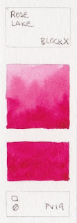
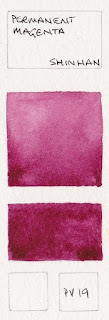
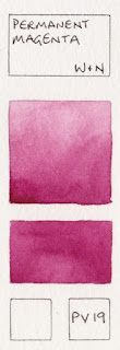
PV19 - pink and rose to crimson to violet
PB36 - turquoise and teal to greenish blue
PR101 - transparent burnt orange to granulating burnt orange to earthy red to very opaque earthy red
and
PBr7 - yellow earth to warm orange browns to dark orange browns to dark cool browns
- are some of the most schizophrenic!
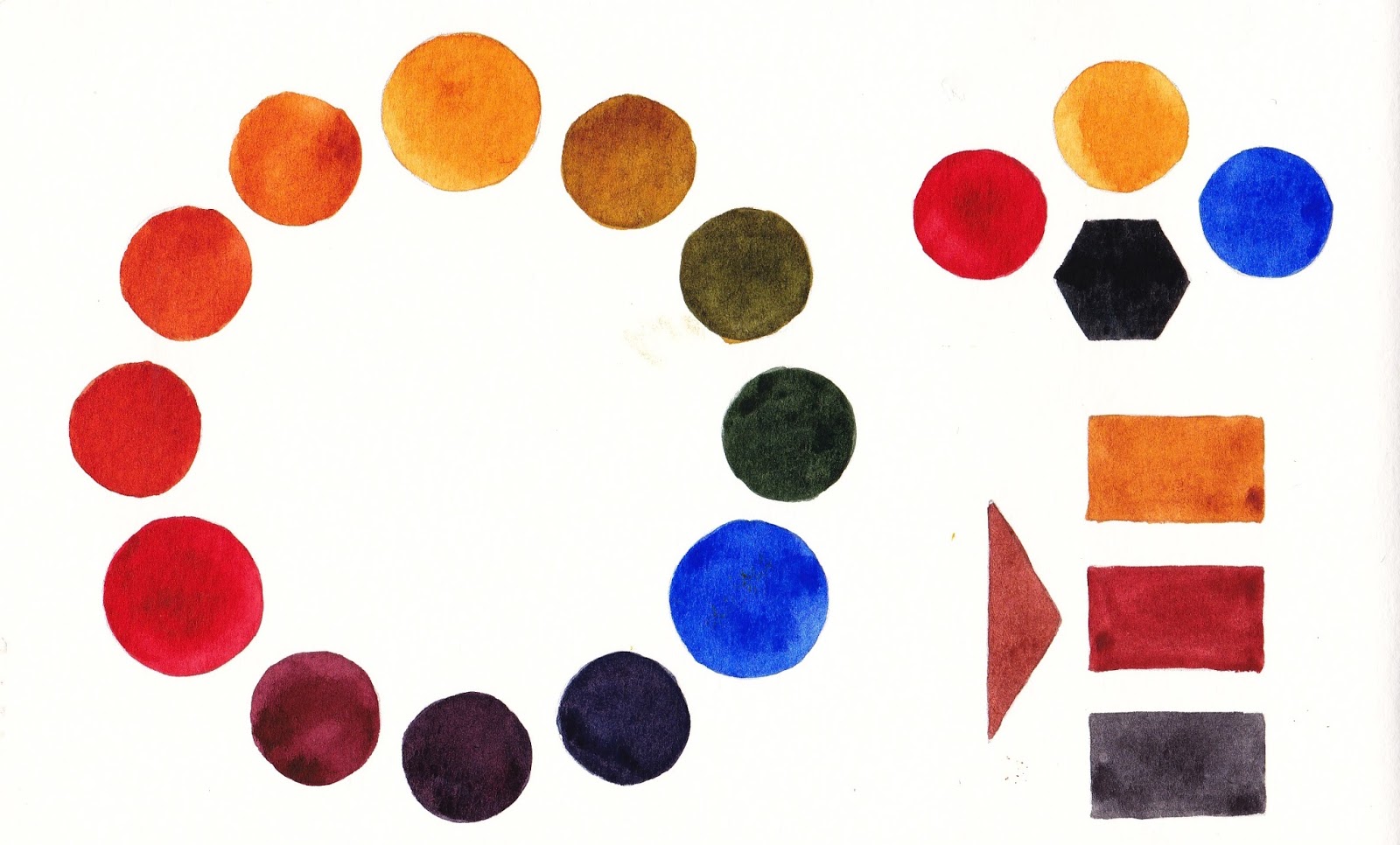
Have a look at the PBr7 and PR101 section in
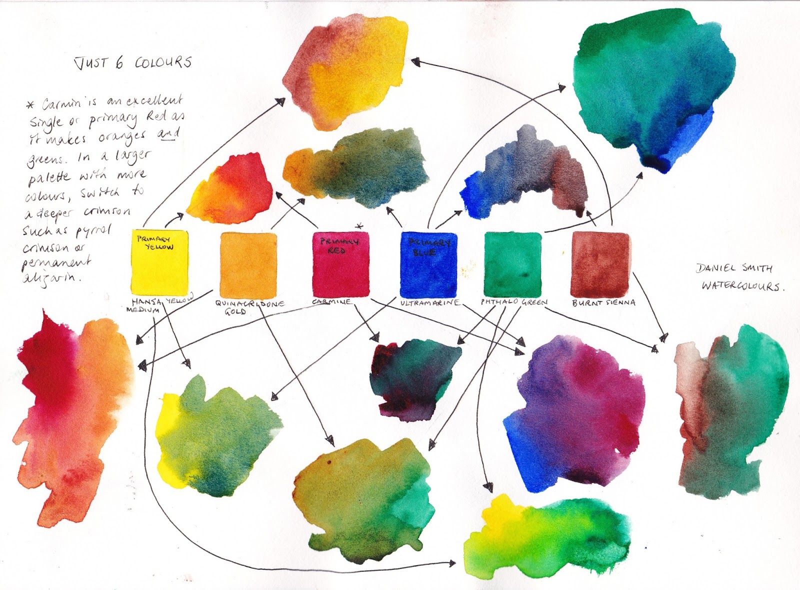
this page of my website and you'll see what I mean. Some pigments cover a small range of colours, like PB29 Ultramarine, but others seem to cover a very large range not only of hue but also of characteristics. I'll look at PV19 here.
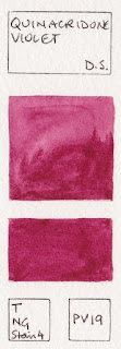
PV19 has a more rose version and a more violet version, though it also appears as a crimson (Alizarin Crimson Quinacridone by Da Vinci) and a dusky pink (rose Madder Permanent Hue by Art Spectrum.) Generally speaking, the more rose version will be called a Quinacridone rose/permanent rose colour where the more violet version will be called Quinacridone Violet or perhaps a magenta or mauve, but it does make it a little difficult to choose a colour based on pigments alone. As always, you need to look at the brand and the name to be sure of what you are getting.


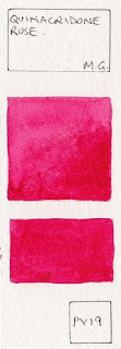

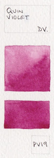


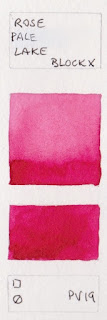


I love Quinacridone Rose as an excellent 'primary' red. It mixes beautiful purples with any blue, especially ultramarine, but also mixes pretty oranges and reds with a yellow. I find the Quinacridone Violet colour less useful as you can make a violet by adding a little blue to the rose, though you can't make a pink by starting with the violet.
The crimson hues made with PV19 are also useful to consider in a limited palette - Alizarin Crimson (quinacridone) by Da Vinci for example is a more crimson red, but still mixes nice purples and oranges.


