Thursday 14 January 2016

2015 - a great year of Urban Sketching - Part 3 - England

St Paul's Cathedral, London. Pencil and watercolour,
Moleskine A4 watercolour sketchbook


April 2015

I took the train from Paris to London, where it was lovely to meet up with my friend Judith from Singapore who is now back home in London. I really wanted to sketch St Paul's Cathedral - I did a tour of this building when I was last in London five years ago in the depths of Winter so this time I walked all around it until I found my spot. It was still cold, but I set myself up in a quiet square and sketched the dome, alternatively with leather gloves and off. I do need to find some good fingerless gloves! We are so lucky in Australia to be able to sketch en plein air all year. By 3.30 it was just too cold to continue. I'm happy with the 'unfinished' look with this one though.


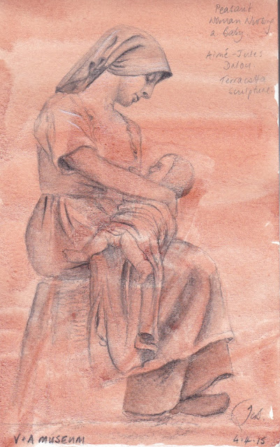
Here I opted for an indoor challenge to keep out of the cold, so I explored the V&A museum. I came across the gorgeous terracotta sculpture of a peasant woman feeding her baby. I had not seen the work of Dalou before. I found another lovely one in Cambridge. I decided to wash in a watercolour background and draw in water-soluble carbon pencils for this study of his 1873 sculpture. I also drew a sculpture of Jason. It is a very different experience to sit and sketch anywhere while travelling rather than racing around trying to see all you can. You see less, but remember it more fully. I found the beautiful expression on this mother's face simply mesmerising.


The crowds moving off after The Boat Race.

A monument near Temple Bar.
One of the highlights of my trip was to meeting up with my daughter and watching the Oxford Cambridge Boat races. I watched the Cambridge lightweights win their races at Henley, and then watched the heavyweights get beaten on the Thames :-(

Putney Bridge, London. A5 Moleskine watercolour sketchbook.

I had plenty of time to sketch some of the many bridges of London while waiting for the races. It was really fun watching the helicopters during The Boat Race - most of the time we couldn't see the Eights but we knew where they were as the helicopters followed the river from Putney Bridge through to the end.
The Hammersmith Bridge, London. A5 watercolour Moleskine sketchbook.

Peta and I explored the banks of the Thames again and I sketched the tower bridge from London bridge, and Marble Arch.
The Tower Bridge, London. A5 Moleskine watercolour sketchbook.
The Marble Arch, London.
A5 Moleskine watercolour sketchbook.
The Minster, York.
A small section of the York Minster.
A5 Moleskine watercolour sketchbook.
City Hall, Sheffield.
A5 Moleskine watercolour sketchbook.

I spent a few days with my friend David, the maker of an extraordinary range of brass watercolour palettes, two of which I now own and love. We went out sketching in Sheffield, York, Clumber Park and a beautiful historical house had a wonderful time chatting about pigments and palette making as we sat and sketched the architecture.


Clumber Park, pencil and watercolour.
A5 Moleskine watercolour sketchbook.

The whole building at Clumber Park - now public gardens

York - the Shambles. Pen and watercolour.
A5 Moleskine watercolour sketchbook.
York - one of the gorgeous old gateways.
A5 Moleskine watercolour sketchbook.
York - ancient ruins. Watersoluble graphite and watercolour. A5 Moleskine watercolour sketchbook.
In Cambridge with my daughter, we rented some bikes and rode to Grant Chester, a charming little village, and also caught a train to Ely.
A charming church in Grant Chester.
A5 Moleskine watercolour sketchbook.
Inside a pub in Cambridge. A5 Moleskine watercolour sketchbook.
A small section of the beautiful college.
A5 Moleskine watercolour sketchbook.
I spent a lot of time walking about and exploring the colleges, and it was still too cold to be sitting sketching that much so many of these will need to be finished off another time. We caught the train to Paris for a couple of days (see Part 2) and then I returned to Hong Kong (see part 1) and home to Sydney.

Many of my sketches from this trip, and in fact going back over thirty years, can be seen on my website http://www.janeblundellart.com/plein-air-sketches.html

Next up - Singapore in July.
   

Wednesday 13 January 2016

Sketching in New Zealand January 2016

Pen and watercolour sketch of a flax flower, 1981

My first trip to New Zealand was in 1981. I met my husband there, so went back on a number of occasions to visit family, friends and of course the beautiful country itself. I was just back for my niece's wedding and, while I didn't get a chance to do much landscape or urban sketching, I did manage to pick up a couple of New Zealand flowers to draw.

I drew my first flax flower back on that first visit. I used a number of isograph pens - those rotten things that you spent more time cleaning and shaking to get them to work than actually drawing with - but they created wonderful even lines.

I have always enjoyed sketching, painting and drawing flowers as I can work from life. I'd love to do some more birds but they obviously move so I'd need to work from photos or in a museum :-(


Green flax flower sketch. Pencil and watercolour,
Moleskine watercolour sketchbook A5


Flowers are a perfect subject. I work life sized where possible and they are generally botanically accurate. There were plenty of other coloured flax plants to choose from but I found three in my niece's garden and tackled them.

This one had quite soft colouring so I used pencil to draw it, then watercolour.


Red flax flower sketch. Pen and watercolour, 
Moleskine watercolour sketchbook A5


The red one reminded me of my first flax study. I used watercolour rather than pen to get the stem nice and dark.

The beatle was dead but I added him as well.


This one was very dark, so lent itself to more pen and ink drawing. I usually use an EF Sailor fountain pen for sketching fine detail, or a Pilot Falcon, with a waterproof Document Black ink. I still love linework, which is perhaps why I am so attracted to these and other rather 'aggressive' looking flowers.


I finished it off in the airport since I wouldn't have been able to fly the specimen into Australia.

Flax flower sketch. Pen and watercolour, Moleskine watercolour sketchbook A5

The last is a sketch of a flower from a Pohutukawa tree - wonderful trees with bright red flowers and deep leaves on the top side that are lighter underneath and almost seem to shimmer in the wind.
Pohutukawa flower sketch. Pencil and watercolour, 
Moleskine watercolour sketchbook A5

Tuesday 12 January 2016

A limited palette with 6 QoR watercolours. Another with 6 Daniel Smith colours.

I tested quite a few QoR colours when they first came out in 2014 - 6 from tubes I was sent as samples and others from small dried out sample dot cards. You can see them all here.

They are all on my website in the Painted Watercolour Swatches section, which is creeping to almost 800 different painted samples now. If you have some more watercolours and would like to send me a sample to paint out, please get in touch :-)

I've been asked about adding some mixing information about these paints.

They are made with a new type of synthetic binder rather than the traditional gum arabic. It makes them feel and behave differently from traditional watercolours - a bit like painting with liquid acrylic, I felt. Golden make wonderful acrylics but I'm afraid I don't find these to be wonderful watercolours - I guess they are just not what I am used to. However, for those who are starting out they may work well. There are certainly some excellent colours but also some that are simply.... weird.

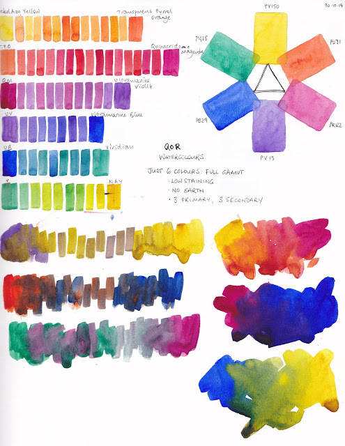
Anyway, I'll include a paintout I did using the palette of 6 that I chose. I decided to go with a balanced full gamut palette of nickel azo yellow PY150, transparent pyrrol orange PO71, quinacridone magenta PR122, ultramarine violet PV15, ultramarine blue PB29 and viridian PG18. No earth colours, and all transparent with three normally granulating pigments. Viridian and ultramarine violet are often quite weak colours so I thought these would be good to test the QoR claim of stronger colours. They are pretty powerful if you pre-wet them well before use, but not very granulating and quite difficult to lift.

QoR exploration - 6 colour full gamut palette.
I was intending having three neutralising pairs in this little palette. As you can see each pair doesn't quite make a grey but there's a lot they could do.

QoR have a much more powerful purple than this - Dioxazine purple, and a much more powerful green - Phthalo green. So this palette could be made up with stronger colours. Bismuth Vandate yellow could be used instead of Nickel Azo yellow. They also have a strong crimson which is the mixing opposite to Phthalo green, which could be used rather than the magenta. So this palette is not intended as a recommended palette, just an exploratory one.


That's the limit of my exploration of these paints. Partly, I guess, since I would actually very rarely set up a palette without burnt sienna, cerulean and a good warm yellow. Also, though it's a pretty colour, and a great mixer, I don't like painting with quinacridone magenta. While I love exploring what limited palettes can do but I don't actually choose to paint with them :-)

I don't know how well this brand would mix with traditional watercolours as I haven't tested them further. If anyone else has, please comment below.

Here is a similar full gamut palette made up with Daniel Smith paints - a powerful crimson (Pyrrol crimson), and the very strong Carbazole violet (the same pigment as Dioxazine violet) and phthalo green. There is more about this palette here. Once again it isn't a palette I would necessarily choose to paint with though even though they are so much fun to explore! My smallest palette contains lots of earthy pigments including burnt sienna and is shown here though I do have a full gamut palette in a silver locket ;-)

Daniel Smith 6-colour full gamut palette exploration 


Saturday 9 January 2016

Open and Shut case(s)

I have been cleaning and filling may various watercolour palettes ready to teach a 5-day workshop in Bathurst, so I thought I'd take a couple of photos of them. They all contain mostly the same colours though they each have a different purpose.

The first is my teaching palette. This is a Herring Compact half pan palette, set up with the thumb hole and brush space filled so it contains 32 colours instead of the intended 16 half pans - that's a lot! More than I'd use in any paintings but useful for demonstrating.

I have it set up with a cool, mid and warm yellow so I can show the differences quickly in how they look and how they mix. It has both the RS and GS versions of Phthalo blue, a Yellow ochre as well as Raw sienna, Goethite and Quinacridone gold to easily show how the various earth yellows behave and mix differently.

It also has a lot of colours including orange and purples that I don't normally have in my regular palette, so I can show how to neutralise colours quickly. I certainly don't suggest that such a large range of colours is in any way necessary, but it's helpful for my teaching :-)

On the right is a brass paint box palette that I use in my studio. It has my 20-colour regular palette colours (more detail here). I can mix any colour I want with these, but sometimes I want to do something a little different in my studio so I have a little palette of 'extras' for added texture. This also lives in my studio and contains some Primatek pigments and some extra convenience colours that I like for special purposes, including some from my teaching palette.

The bottom row has my 'Tardis' brass palette - so named because it has a lot of colours in a small space :-) I take this with me for plein air sketching and travelling and it is my outdoor workhorse palette. It contains my studio 20 colours as well as some extras for special purposes - Raw Sienna for people or the glow of sunsets, Rich green gold for foliage, along with Transparent red oxide and Piemontite genuine - interesting granulating colours that are great for rusty effects and landscape textures.

Next is my 'Little Lady' brass palette - this lives in my handbag so I always have it with me. Best for pocket or A5 sized sketches, it is very cute but also remarkably practical. It contains my 20-colour palette along with some other extras - Serpentine genuine for instant grassy meadows, Cobalt Turquoise for copper effects on buildings, and Green apatite genuine for wonderful foliage effects. It currently has Moonglow as the 4th colour but that may switch to the lovely granulating Lunar black or the opaque yellow ochre. The 'extras' spots in this little palette can swap around thanks to David's inventiveness - very clever :-)

The final palette is an Italian metal full pan palette that I picked up on sale and have only recently set up for teaching and demonstrating with larger brushes. My studio palette, which doesn't normally leave the house, has good access for larger brushes but the others are better for smaller brushes. This final palette basically contains my ultimate mixing set with a couple of extras, though it has a real mix of brands where the others are totally Daniel Smith. It has a genuine Quin Gold PO49 from W&N - old stock I found from before they ran out of that pigment, a Schmincke pure yellow I was testing, quite a few Da Vinci paints, and some Daniel Smith for the rest of the colours. It's large for plein air but may work out well for teaching.

The first photo shows them open. Here they are closed.


In all there are 38 pigments that I like to have available in my studio. I'd use about 10 to 15 of them most of the time, mostly my ultimate mixing set, and in most paintings I may use only 5 - 7 pigments. However one of the joys of watercolour is that it isn't just about the colour, it's about the wonderful textures you can achieve with a granulating colour, or the different appearance of a transparent vs an opaque colour in a mix. I love to explore all of the characteristics of watercolour in my painting.

To see more palette ideas, have a look at my website here.