My Ultimate Mixing Palette is designed to be a universally useful range of colours, without the idiosyncratic colours that are often found in recommended palettes. I chose each colour not only for what they could do alone, but also how they mixed with the other pigments to create more colours. It is designed so that usually only two colours are needed so it is easy to create whatever colour is desired. I included some my own palette choices, of course, but I wanted to explore other options to see if there were better ways to work. I wanted a relatively small number of colours with excellent mixing options. I wanted colours that are readily available and didn't cause confusion. I really wanted to focus on yellows, reds, blues and some interesting granulating earths but also added phthalo green for its versatile mixing potential.
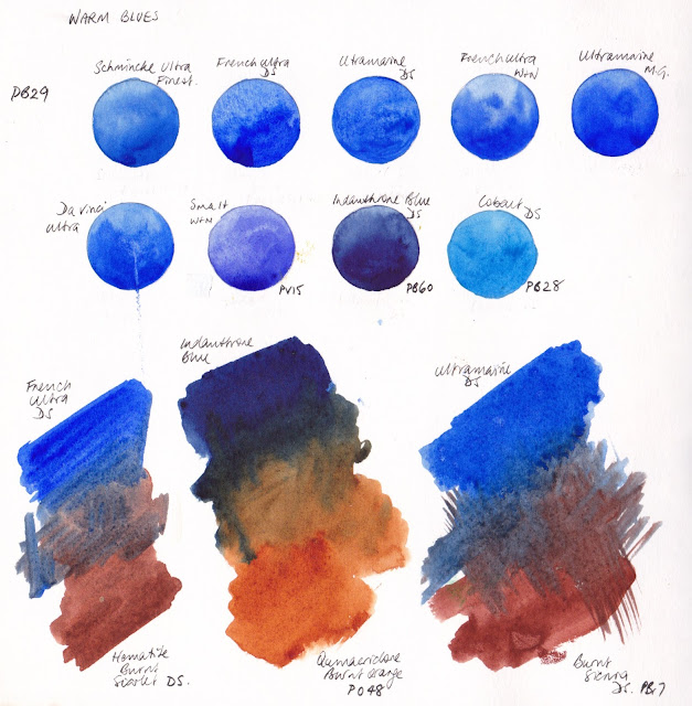
I tend to start with blues. Ultramarine is a basic blue in a watercolour palette and a real favourite. If I only had one blue that's what I'd have. My second would be Cerulean Chromium as it is great in skies, then I look at the phthalo blues as a strong, staining cool blue. Here I was comparing warm blues including different brands of ultramarine blue. The various ultramarines are largely interchangeable though the DS version once again is my favourite because of how it mixes with DS Burnt Sienna to make my Jane's Grey. I like the less granulating Schmincke version and Da Vinci paints are always excellent. I liked the M.Graham colour too but I don't like the gooey M.Graham paints for plein air work. I also love the richness of Indanthrone Blue, which is the fourth blue in my 20 colour personal palette, though it is not an essential colour. Cobalt is beautiful but doesn't have the depth of Ultramarine.
On the next page I was comparing more burnt sienna options and ultramarine. I wanted to explore some of the many other neutral orange options too. I looked at DS Burnt Sienna, Da Vinci Burnt Sienna, M. Graham Burnt Sienna, DS E.F. Red Iron Oxide, DS Transparent Red Oxide, DS Quinacridone Burnt Orange and Schmincke English Venetian Red. I also explored a few different ultramarine options along with the more purple W&N Smalt Genuine. I concluded that the DS ultramarine and DS Burnt Sienna was still my favourite due to the lovely grey this pair makes. Da Vinci Burnt Sienna is also very nice - it is slightly more orange. I use the DS burnt Sienna in my personal palette but also have the slightly wild DS Transparent Red Oxide as a more granulating and brighter 'extra' in a 24 colour palette as it is perfect for Australian sandstone.
At the bottom of the above page I was looking at the various Burnt Umber options. I have this in my 20-colour palette simply because it is faster than mixing ultramarine and burnt sienna to make its hue. It is not an essential colour but a useful convenience colour.
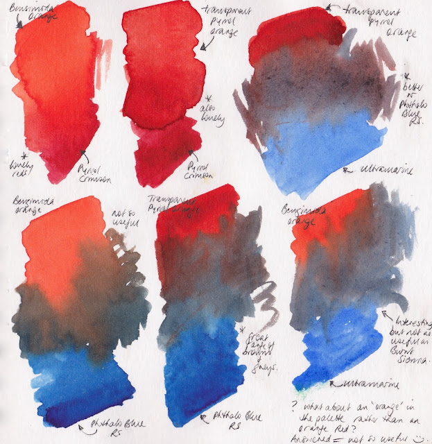
In the next tests I was trying to decide whether it was perhaps worth having an orange rather than a warm red in the palette. Burnt Sienna is a basic neutral orange in my palette so I was looking at whether a bright orange would also be useful. I concluded that it doesn't add as much as a warm red. A bright orange can be mixed very easily, and I find that burnt sienna is more useful as a base colour. In this case I was looking at Transparent Pyrrol Orange as my warm red. I also looked at Pyrrol Scarlet later. The first mixed explorations on this page were looking at what combination of a warm red and a crimson would make a bright 'fire engine' red - useful to be able to mix but not an essential palette colour.
I don't choose to have a purple in my palette as they are so easy to mix but I do need the right pigments in the palette to be able to make a beautiful clean purple. I planned to have a cool red - either Quinacridone Rose PV19 or Quinacridone Magenta PR122 as the cool red for making purples. The blue was going to be Ultramarine so I tested DS Quin Red, MG Quin Rose, DS Quin Rose, Schmincke Purple Magenta, DS Carmine and DS Pyrrol Crimson to compare the purples they created. I settled on DS Quin Rose as it is a lovely colour for floral works.
The yellow explorations are to see whether a warm yellow, such as New Gamboge or Hansa Yellow Deep is necessary. I tested Nickel Azo yellow here but elsewhere I also tested other cool and mid yellows and chose DS Hansa Yellow Medium as the most useful primary yellow, along with DS Quin Gold as the warm yellow as it mixes such gorgeous greens.
Here I am looking at mixing pairs and my goal was to create a 24 colour wheel with single pigment colours where each would neutralise its opposite. Notice how close together Transparent Pyrrol Orange and Pyrrol Scarlet are on the colour wheel. Also how close together Phthalo Blue GS and Phthalo Blue RS are. These were two important pairs to consider, as I'll discuss below.
The next mixes are the opposites from the colour wheel mixed together. Most neutralise each other beautifully, creating wonderful neutralised red, oranges and yellows which are of course Indian and venetian red hues, yellow ochre, raw sienna and raw umber hues and burnt sienna and burnt orange hues. If you know how to mix them, you don't need to have the earth pigments in a palette, though painting is faster and simpler if you do.
A really important couple of mixes are shown here. Look at number 6 and 7. Notice that in mix 6, Phthalo Blue RS + Transparent Pyrrol Orange - the hues are a series of warm browns. They are beautiful burnt orange, burnt sienna and burnt umber colours along with a rich black (with I sometimes premix as Jane's Black B/O) and greys. You can see this pair again further down this post, with the rich blacks and browns shown.
In mix 7, Phthalo Blue GS + Pyrrol Scarlet, the hues are lovely indian red, venetian red, light red colours. This is generally a more useful mixing pair as it doesn't replicate the fantastic Burnt Sienna + Ultramarine pair shown in mix 5. I chose this mixing pair - mix 6 - for my Ultimate Mixing Palette set as I wanted a set of colours that give the most options. This is true even if you reduce the palette to just 12 colours and remove the Indian Red and Raw Umber.
Personally, though, I like the warm browns made in mixture 6 and use this pair in my palette. It isn't as useful generally but is a personal preference. I know how to adjust the colours to make the Indian red hues if I need them. In my Ultimate palette I also thought it would be less confusing if the warm red was called Pyrrol Scarlet rather than Transparent Pyrrol Orange! Phthalo Blue GS is a very common palette colour. The Red Shade is the perfect colour for an Australian sky, at times, but the Green Shade is a more obvious cool blue, so it is also in my Ultimate Palette, and my teaching palette. Phthalo Blue GS and Pyrrol Scarlet are an almost perfect neutralising pair, creating another interesting black. (Jane's Black R/B.)
Another really important mix is shown above - number 9. This mix of Phthalo Green BS and Pyrrol Crimson creates a fabulous rich black, that I mix as a pre-mix if I am working with a lot of dark passages (Jane's Black R/G). Adjusting the balance slightly to the red side creates a range of deep aubergine and plumb colours that are otherwise not easy to create. It also creates a deep perylene green hue if adjusted to the green side - fantastic for deep foliage shadows. I have other pages that test out different crimson mixes but chose the single pigment Pyrrol Crimson. So I find that 3 reds - a warm, a crimson and a pink/rose red really is ideal for maximum mixing options.
In this next page I was looking at how few colours you could get away with and still create a range of colours (if you know how to mix them). The key to these limited palettes is the orange/blue combination once again as that is what creates the brown and grey range. The red needs to create clean purples with the blue but also clean oranges with the yellow. This palette is interesting as it has no earth colours since they can be created by mixing. I was looking at whether Carmine (a crimson) or Quin magenta is most useful, though I think I prefer Quin Rose in the end as a great cool primary red.
Here is the same idea using Phthalo Blue RS and Transparent Pyrrol orange with Schmincke Purple Magenta (PR122 - Quinacridone Magenta in most brands) this is a gorgeous set if you only want a few colours, but you need a lot of mixing space. Notice again the lovely mixtures you can make with Transparent Pyrrol Orange and Phthalo blue GS. The mixes would be similar with Quinacridone Rose instead of the PR122 magenta.
Here is my Ultimate Mixing Palette, set up around the colour wheel. Orange and purple are so easy to mix they are not necessary unless you want them for convenience.
If you find these explorations helpful, do please let me know and I'll post up some more.
Colour is such fun! Happy painting.


