Thursday 20 November 2014

De Atramentis Document Inks mixed with Black - Updated January 2015


I don't usually use black when mixing with watercolour, but with a CYMK mixing set it certainly increases the options and is the only way to create some hues and tones.

There are 9 inks available in the De Atramentis Document range so far. Yellow, Red, Magenta (also called Fuchsia), Blue, Dark Blue, Cyan (also called Turquoise), Green, Brown and Black. Here you can see each of the colours mixed with black. When the White is available I will do the same with that. Document Fog Grey (which is really a very dark blue) will also be added here soon.

It takes VERY little Black to make a change to the original colour so I haven't included ratios for these mixes.


Here is Document Yellow mixed with Document Black. It's a lovely bright mid yellow and a strong tinting ink. The Black is really very pure - notice the yellow is darkening rather than turning green as it might with many blacks that are on the blue-side.

Document Red mixed with Document Black gives a lovely range of red-earth hues like an Indian Red or Venetian Red. (Doucment red looks the same as a mix of 1:1 Document Yellow + Document Magenta)


Document Magenta (also called Fuchsia) mixed with Document Black. There are a few more possible tones between the pure colour and the first mix but I added too much black too quickly. It takes SO little to make a change!


Next is the warm Document Blue mixed with Document Black. A nice range of deep blue and indigo hues are possible.


Document Dark Blue looks like a mix of Document Blue and Document Black so is already a lovely dark blue.


Next is Document Cyan (also called Turquoise) mixed with Document Black, making cooler deep blues.


Document Green, which looks like a mix of Yellow and Cyan at a ratio of 1:4, mixed with Document Black makes wonderful deep bottle greens.


And finally Document Brown mixed with Document Black to make a great range of dark brown and sepia hues.


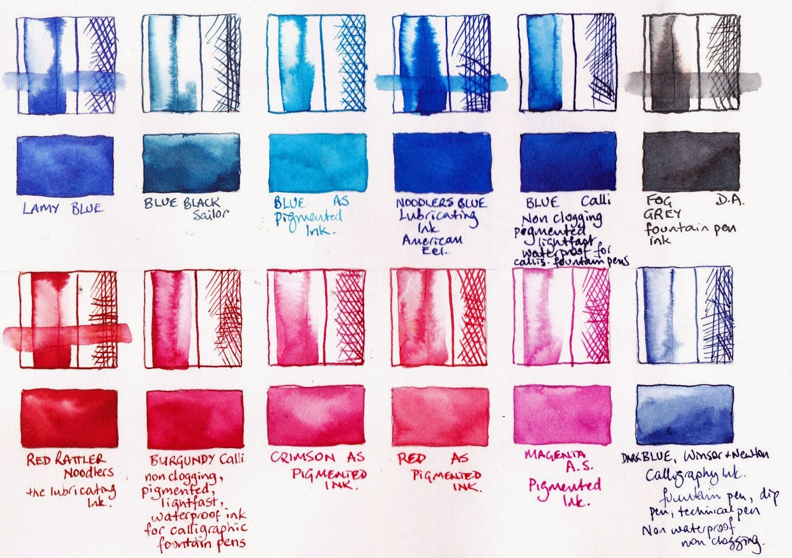
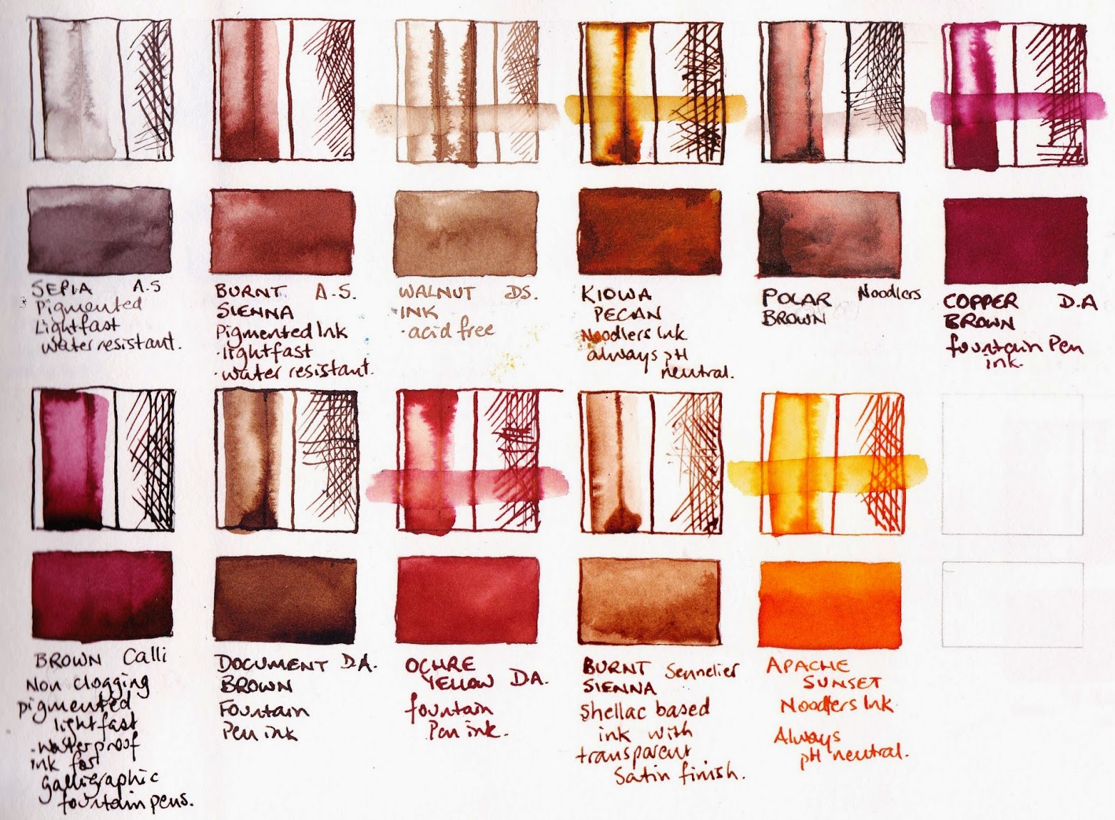
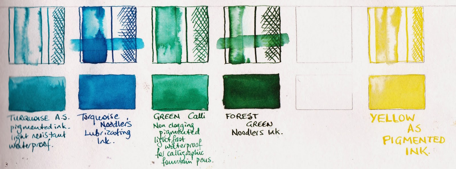
To see these colours mixed together see the previous post here.


Tuesday 18 November 2014

Mixing De Atramentis Document Inks Updated January 2015


I am really enjoying working with the De Atramentis Document Black and Document Brown fountain pen inks. I have been gradually buying the other document colours as I find them in various shops in Sydney Australia, including Larrypost, Art Scene, Tilly's and Pen Ultimate, or from Gouletpens in the US. A couple of sample shipments from De Atramentis has enabled me to add Yellow and the thinning solutions, along with Red, Green and Dark Blue. See the full range - Yellow, Red, Magenta, Blue, Dark Blue, Cyan, Green, Brown and Black here.

A Document Grey is now available in some areas, though it appears much more a dark blue than a grey.  Burnt Sienna and White are in the pipeline.

To have a good range of lightfast, waterproof, fountain pen-friendly inks is one thing, but to then be able to inter-mix them is really exciting for an artist. I'm looking forward to experimenting with them as liquid watercolours. They rate the maximum 8 on the blue wool scale so should be fine in framed finished works. (Of course I'll do my own testing :-)

So I have been mixing them, and explored making a range of mixed colours measuring drop by drop. It's not perfect - how big is a drop? - but it gives a good idea of just some of the colours possible. All these colours are full strength. A thinning solution is also available. These are painted out in a Stillman & Birn Alpha A4 sketchbook.

Here is Document Blue mixed with Document Magenta in the ratio written below. Document blue is a lovely warm blue so the purples are clean and beautiful. August 2015 - a Document Violet has been added to the Document Range.


Here is Document Turquoise (Cyan is a more helpful name here) with Document Magenta. Notice how the colours overlap the mixes above so you can make your own document Blue hue, though the Document Blue ink is very nice and acts as a wonderful warm mixing blue.


My next mixes were with Document Turquoise (which will be called Cyan) and Document Brown. The cool blue creates lovely turquoise and green hues and a great olive green and cooler brown.


The next range with a warmer Document Blue creates a lovely deep blue, grey and warm Sepia and burnt umber browns when mixed with Document Brown. I am loving working with this mixed grey and have also used a slightly thinned version in a fountain pen :-)


And here is a range of deep red and maroon colours made with Document Magenta and Document Brown.


Here is Document Yellow mixed with Document Blue. I always love the more natural greens you can make with a warm blue.
Document Yellow mixed with Document Cyan will create much brigher greens.


Document Yellow mixed with Document Green makes ever warmer greens.

Document Yellow with Document Brown makes wonderful yellow ochre, raw sienna hues. You can see this combination in action in Liz Steel's sketches here.
And Document Yellow mixed with Document Magenta makes gorgeous oranges, reds and crimsons :-)


Here is Document Yellow mixed with Document Red.
All the colours can also be mixed with the Document Black for deeper shades. I've started playing with those mixes and you can see them here.

I then did some exploration of three colour mixes. I will add more on these as a separate post. These are quite deep and dark but rather interesting. The first were made with various ratios of Document Blue, Magenta and Brown.


The next were made with the same ratios using the cooler cyan, (Document Turquoise), Magenta and Brown.


For more on drawing with inks see Working in Ink here, or Sketchbook Pages Exploring Fountain Pen Inks here. For more on coloured inks see here. For Brown Inks comparisons see here.

Friday 7 November 2014

Coloured drawing inks

I have been wanting to do a careful comparison of my many fountain pen and drawing inks and finally washed over the samples to see which are waterproof.

I drew the squares in pencil, draw a line on the left on dry paper and touched the line with water to make it bleed. I then did a second line on the then-wet paper to see how it dispersed in wet. Then I did the cross-hatching on the right of the square on dry paper, then painted the rectangles and allowed all of them to dry completely. I then painted a wash of water through the square and some immediately re-wet, others were completely waterproof.

For writing you may not need to use waterproof ink, and even for drawing you may prefer to have water soluble ink if you wish to use water to create some tones. I just like to know what my materials will do.


 The inks were tested using a dip pen with a 'post office' nib as that is how I prefer to use them, except the De Atramentis inks and Lamy Blue which were in fountain pens.


 The colour of the Copper Brown and Calli Brown is certainly rather crimson, but not as much as the image on my computer :-(  Ochre Yellow is rather orange but most of the others a reasonably accurate in colour. Many companies, such as www.gouletpens.com, offer samples for a reasonable price and also have painted/drawn samples to view on their websites.


The A.S (Art Spectrum) pigmented inks are terrific for drawing with a dip pen. They are waterproof and lightfast and highly pigmented for good strong colour. I shake these well before use.

The Calli inks were also completely waterproof.

I am using Da Atramentis Document inks in Black and Brown in my fountain pens and am very happy with them. I'll also use their regular non waterproof inks for writing and some drawing, and Lamy inks in my Lamy pens. The rest I prefer to use with a dip pen in the studio.