I have posted in detail about
Ultramarine as a primary Blue. Here I will show comparisons of a larger range of blue watercolours from different manufacturers. I have now added all these and more to my website so you can compare them all
here.
Ultramarine (updated February 2018)
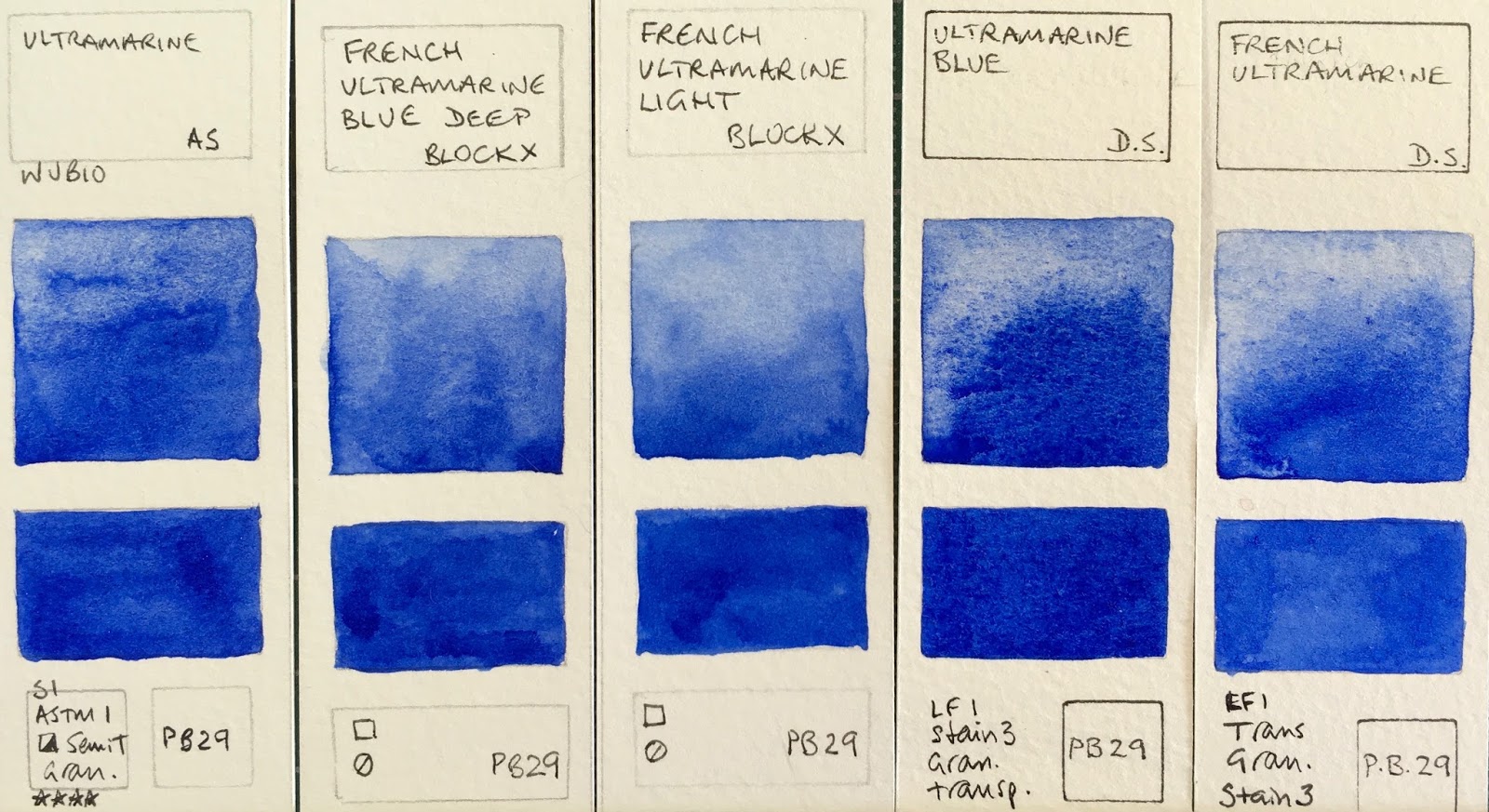
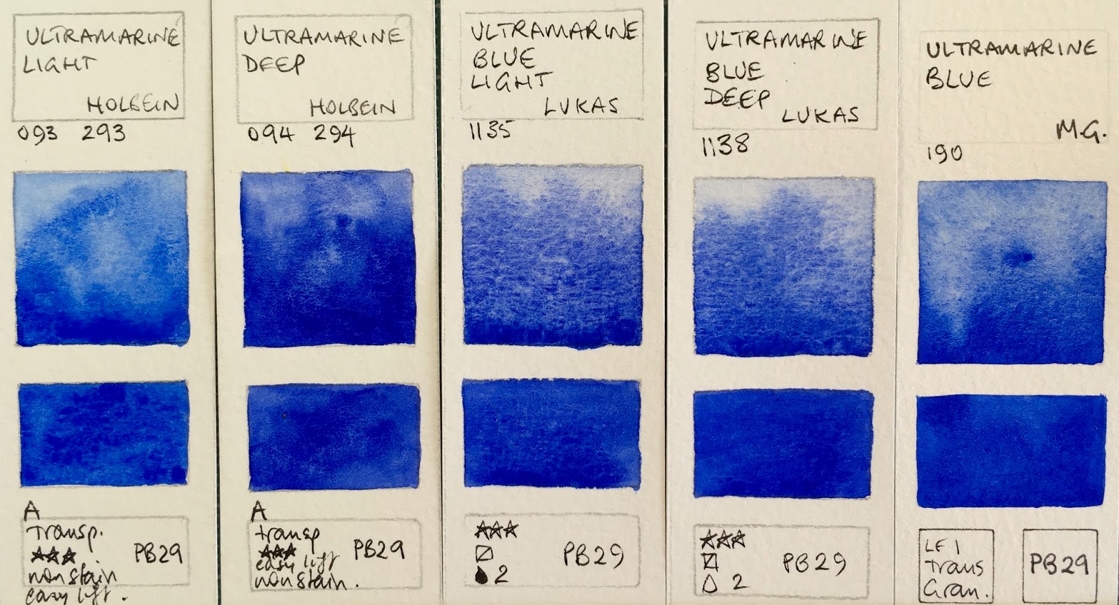
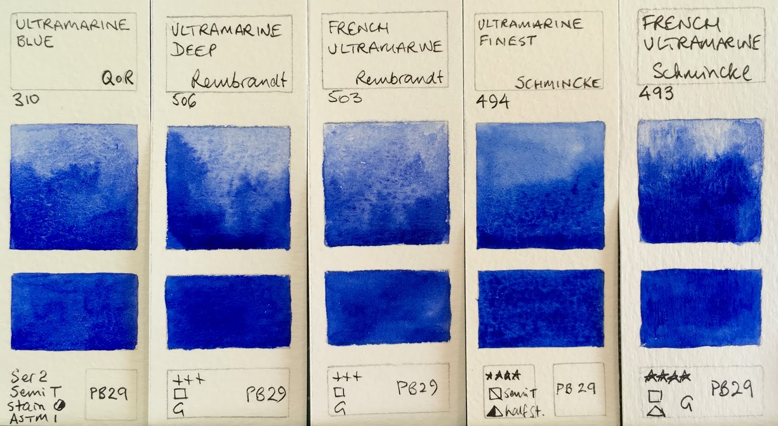
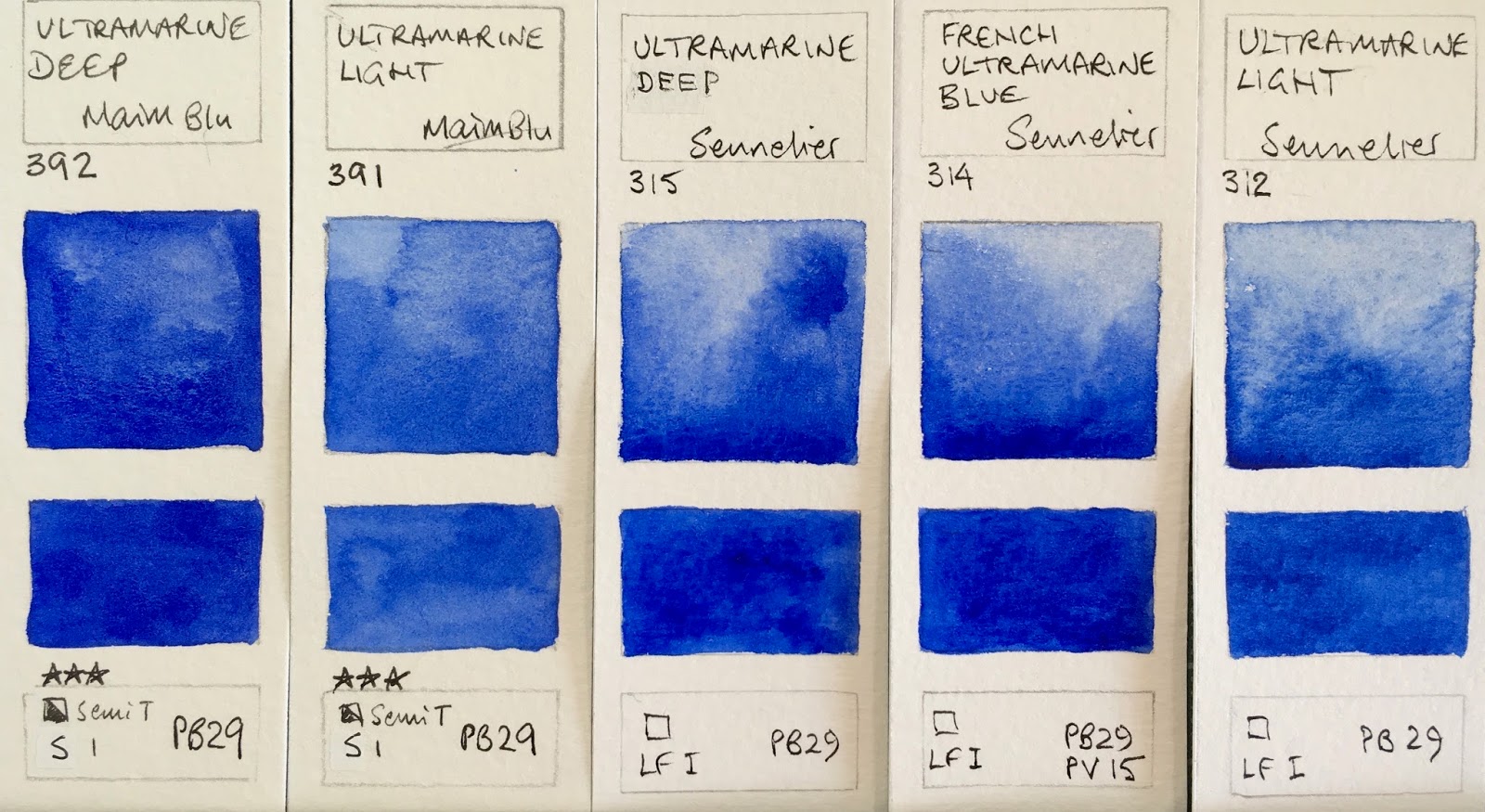
Ultramarine has been covered in more depth in a previous post. It is a warm blue so leans toward purple - they all have a hint of red in them. They will mix with a rose or pink to create beautiful clear purples, and with a yellow to make slightly neutralised greens. Here are a number of examples all made with PB29 (though one is a two pigment mix). They vary in how easily they re-wet, the amount of granulation and also slightly in hue. My favourites are Da Vinci and Daniel Smith, though I also like the new Schmincke French Ultramarine added in 2017. These photos are taken under 'sunlight' bulbs with no adjustment for best comparison.
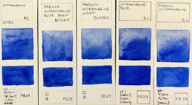 |
| Ultramarine Blue Watercolours: Ultramarine - Art Spectrum, French Ultramarine Blue Deep - Blockx, French Ultramarine Light - Blockx, Ultramarine Blue - Daniel Smith, French Ultramarine - Daniel Smith. |
 |
| Ultramarine Blue Watercolours: French Ultramarine Permanent (RS) - Da Vinci, Ultramarine Blue - Da Vinci, Ultramarine (Green Shade) - Da Vinci, French Ultramarine - Daler Rowney, Permanent Blue - Daler Rowney. |
 |
| Ultramarine Blue Watercolours: Ultramarine Light - Holbein, Ultramarine Deep - Holbein, Ultramarine Blue Light - Lukas, Ultramarine Blue Deep - Lukas, Ultramarine Blue - M.Graham. |
 |
| Ultramarine Blue Watercolours: Ultramarine Light - Mission Gold, Ultramarine Deep - Mission Gold, Ultramarine Blue Deep - Old Holland, Olutramarine Blue - Old Holland, French Ultramarine Light Extra - Old Holland. |
 |
Ultramarine Blue Watercolours: Ultramarine Blue - QoR, Ultramarine Deep - Rembrandt, French Ultramarine - Rembrandt, Ultramarine Finest - Schmincke, French Ultramarine - Schmincke (new 2017)
|
|
 |
| Ultramarine Blue Watercolours: Ultramarine Deep - MaimeriBlu, Lutramarine Light - MaimeriBlu, Ultramarine Deep - Sennelier, French Ultramarine Blue - Senelier, Ultramarine Light - Sennelier. |
 |
| Ultramarine Blue Watercolours: Ultramarine - St Petersburg, Ultramarine Blue - Schmincke, Ultramarine - White Nights, Ultramarine (Green Shade) Winsor & Newton, French Ultramarine Blue - Winsor & Newton. |
 |
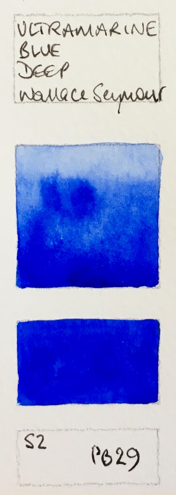
Ultramarine Blue Watercolours: Ultramarine Blue Deep - Wallace Seymour.
|
Cobalt Blue
Closest to a primary blue in that it is neither 'greenish' nor 'purplish', Cobalt is a lovely but expensive pigment. Look for the genuine PB28 for the most beautiful and liftable granulating washes. Some artists prefer cobalt to the deeper Ultramarine as a basic blue. I have it as an 'extra'.
 |
| Cobalt Blue W&N, Cobalt Blue ShinHan, Cobalt Blue Hue Derivan, Cobalt Blue AS, Cobalt Blue DS PB28. |
Cerulean
Cerulean varies from brand to brand but generally behaves as a cool blue making bright greens. Genuine Cerulean PB35 is slightly warmer than my preferred Cerulean Chromium PB36 DS. It is a rather opaque colour with plenty of granulation and particularly useful for skies and for mixing opaque greens.
 |
| Cerulean Blue Derivan, Cerulean Blue W&N, Cerulean Blue (Hue) Da Vinci, Cerulean Blue DS |
 |
| Cerulean Genuine DV, Cerulean Blue Chromium DS, Cerulean Blue Deep OH, Cerulean Blue Genuine DV |
Phthalo Blue
A cool and staining blue, phthalo blue is a very common colour in any palette. Available in Green Shade and Red Shade versions, with the green shade being the most common. Phthalo Blue Red Shade is another primary blue option if transparency, staining or non granulating properties are desired.
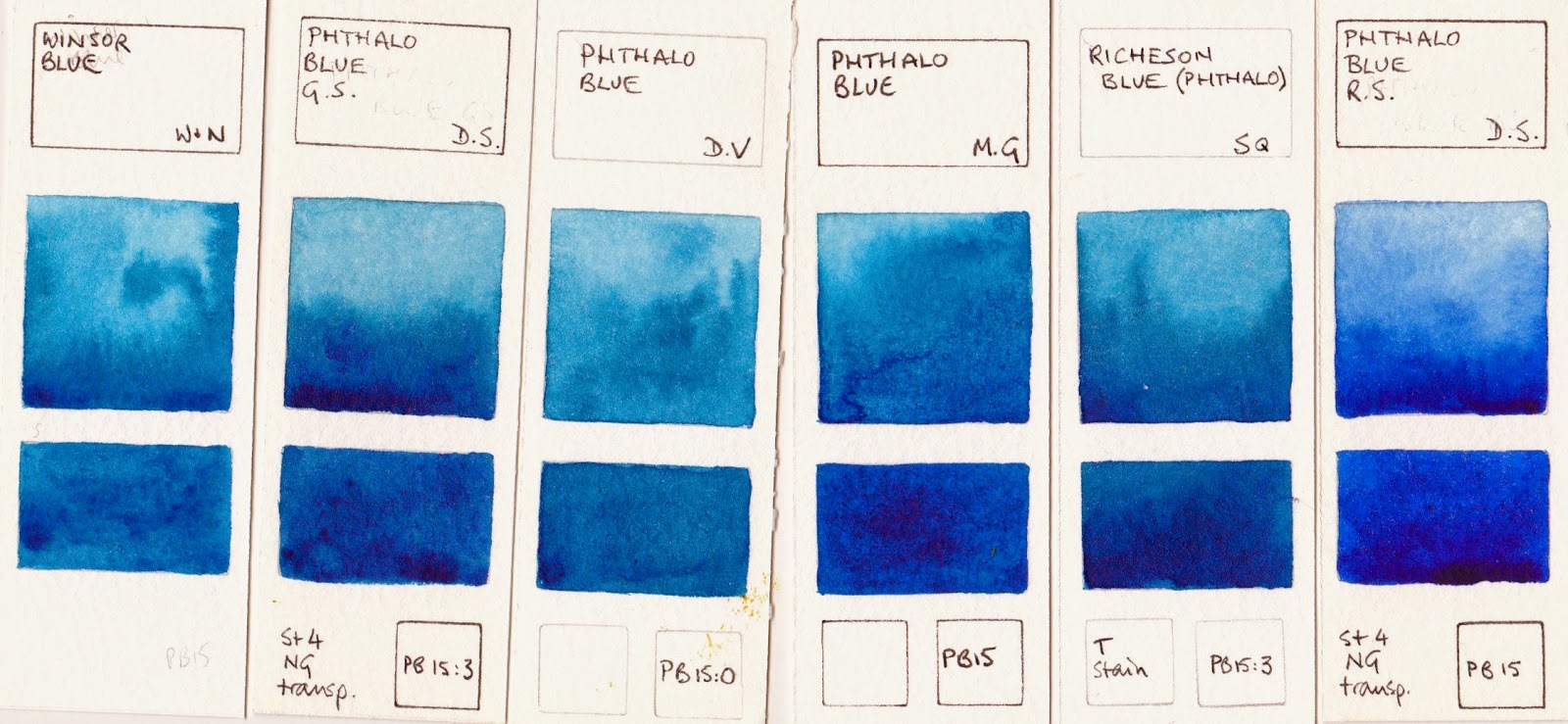 |
| Winsor Blue W&N, Phthalo Blue GS DS, Phthalo Blue GS DV, Phthalo Blue MG, Richeson Blue (Phthalo) SQ, Phthalo Blue RS DS. |
Prussian Blue
Not one of my favourites, Prussian Blue is an alternative blue if a less staining cool blue is desired. Made from PB27. Easily mixed with Phthalo Blue and a warm red.
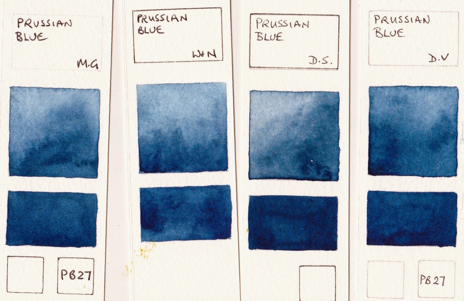 |
| Prussian Blue MG, Prussian Blue W&N, Prussian Blue DS, Prussian Blue DV |
Deep Blues
Genuine Indigo is not light fast but the colour is very popular. It is a deep blue that can be warm or cool depending on the manufacturer. Often made with Indanthrone blue or phthalo blue and black, Da Vinci is unusual as it is made from Prussian Blue and Quinacridone Rose or Violet.
Indanthrone Blue also varies, with Daniel Smith being a warm version and Winsor and Newton a cooler. The S. Quiller example is in between. I don't often use indigo though it is rather lovely with quinacridone gold, but I love using DS Indanthrone Blue in dramatic skies.
Manganese Blue
Sadly most versions of Manganese Blue are hues and don't have the magical granulating characteristics of the genuine pigment, famous for painting snow effects. It is not an essential colour as it is not strongly tinting but quite beautiful.
Other Blues
The first three of these are mixes of little value as far as I can see. Smalt Genuine is an interesting very warm blue - almost a violet, made in a limited edition by Winsor and Newton. Lunar Blue is made of the highly granulating Lunar Black with phthalo blue and is wonderful for special effects. Daniel Smith Mayan Dark Blue is an interesting stormy blue colour thought I prefer Sodalite below, Mayan Blue Genuine did nothing for me!
Primatek Blues
These Daniel Smith colours are fascinating to try. I love the granulation of Blue Apatite Genuine and Sodalite Genuine, especially for stormy skies or a granulating grey option. Some were very disappointing.
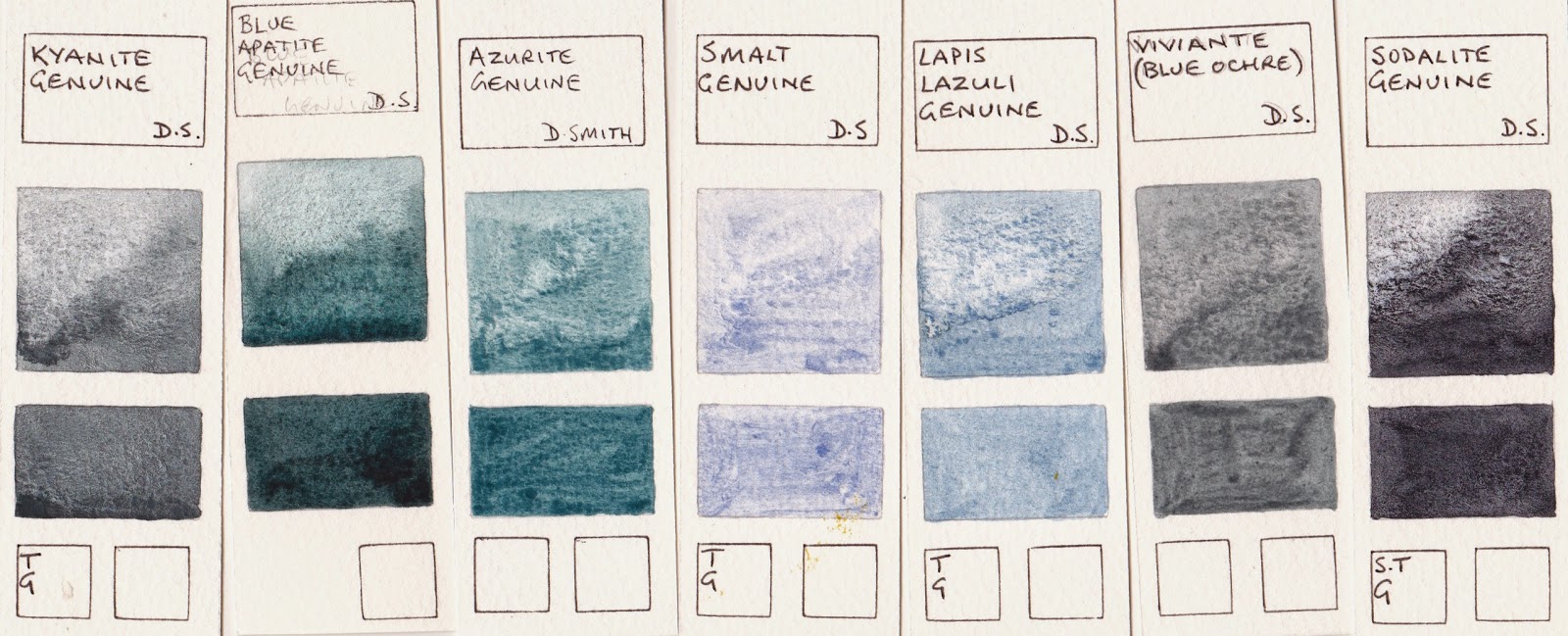 |
| Kyanite Genuine, blue Apitite Genuine, Azurite Genuine, Smalt Genuine, Lapis Lazuli Genuine, Vivianite Genuine, Sodalite Genuine (all Daniel Smith) |
So how many to you need?
Depending on the size of your palette, you may work with just one blue such as Ultramarine or Phthalo Blue RS that you warm up or cool down as required, two blues - probably both ultramarine and phthalo blue GS, three if you want to add the granulating and more opaque cerulean, four if you want to add the deep indanthrone blue, 5 if you want a granulating special effects blue....and so it goes on. The blues you choose need to work to make a good range of greens and purples and are very important colours on your palette. I like to have at least three - Ultramarine, Phthalo blue and Cerulean PB36. My basic palette of 20 also has Indanthrone blue, and I have Blue Apatite Genuine and Sodalite genuine and some others as special effect colours in my studio.
Watercolour Comparisons 1 - Ultramarine Blue
here
Watercolour Comparisons 2 - mid yellows
here
Watercolour Comparisons 3 - Primary Red
here
Watercolour Comparisons 4 - Burnt Sienna
here
Watercolour Comparisons 5 - Greens (Single Pigment, convenience mixes and special effect)
here
Watercolour Comparisons 6 - Reds (Cool, mid and warm)
here
Watercolour Comparisons 7 - Yellows (cool mid and warm)
here
Watercolour Comparisons 8 - Blues
here
Next up - Earth Yellows.


Thanks for posting these color comparison posts. They are extremely helpful. I just received my copy of your watercolor mixing book and am looking forward to reading and re-reading it.
ReplyDeleteI am glad to hear you like Blue Apatite Genuine (BAG). I bought the BAG as part of a special color triad offer and really like it. It has replaced Prussian blue on my color palette.
Thank you Charlie. I still have a large number to organise and post up but it's nice to know they are helpful :-) I hope you enjoy the book. Do add your own notes as you go.
DeleteYes Blue Apatite Genuine is a lovely colour for special effects. You could probably mix the hue but not really recreate the granulation. I think you'll find it a more interesting pigment to use than Prussian blue, which is an easily mixed colour.
Blue is the most irresistible color to me--thank you for this in-depth exploration, which is a pleasure to look at too!
ReplyDeleteThank you Laura :-)
DeleteWell done Jane!
ReplyDeleteThank you!
DeleteThere are hundreds of other painted watercolour comparisons on my website in the 'Resources and Tutorials' section.
www.janeblundellart.com
Love your website and so very helpfull! I ordered the PDF version of your updated book
ReplyDeleteI really wish it could have been the ebook but it's only made for iPad and I have a Samsung s2 tablet and I thought I could use the kindle app but no...maybe it can be changed in the future as the Samsung tablet's are winning the tablet wars and I pads are selling less and less according to apple...OK time to dive into these beautiful charts :)
I understand, however the Mac/iPad allows a 'fixed format' so the words and images don't disconnect. This keeps the index and cross-referencing in tact, especially for The Ultimate Mixing Palette. PDF is the only other way to make them available. I hope you find it helpful :-)
DeleteI tried to find Manganese Blue by Old Holland, but it is not even showing up in the search engine. I can find it in Ild Holkand swatches, but online ut is not available anywhere. Can it be discontinued?
ReplyDeleteYes the pigment is no longer available so Old Holland discontinued manganese blue this year (2016) though some tubes may still be found...
DeleteHi Jane! I have just recently picked up watercoloring and have found your comparison charts invaluable. You have mentioned other comparison charts (purples, earth yellows, etc.) but I am unable to find them on your blog. Can you direct me to them?
ReplyDeleteLisa
Dublin, Ohio, USA
Lisa - the links to the other comparisons I have done as blogs are at the bottom of the post above. To see all the 800+ watercolour samples, go to my website here http://www.janeblundellart.com/painted-watercolour-swatches.html and each page shows a new colour to compare them all.
DeleteSmalt blue is the centuries old name for cobalt blue as smalt is finely ground cobalt blue glass.As most cobalt blues are hues W&N has differentiated their genuine cobalt blue by using the word Smalt .The other smalt blue genuine by DS has barely any pigment . Ultramarine was produced from ground Lapis which was not available in Europe and had to come 'over the sea'(ultra marine).Lapis Lazuli or genuine ultramarine is very rich when home made from chunks of Lapis which sometimes has red spots to give that intense slightly red blue.Any genuine earth pigment colour is going to be lacking in pigment unless you pay the price of course as you can see . In watercolour work you really do get what you pay for although many years ago cheap chinese paints were available with natural earths from the Pound (dollar) shops .Paynes grey (not shown here ) is another useful blue and is great for creating the blues seen in darkness .If building a basic palette os 6 or 7 tubes or pans ( that is all you need to create a broad spectrum of colours and effects) generally buy the best you can afford if you are unable to make them yourself( some like natural Sepia are available for use straight from the fish ) which generally means avoiding lakes and hues .
ReplyDeleteHi Jane -
ReplyDeleteI like having cerulean in my palette for skies, but it's the only somewhat opaque color in my palette. I noticed it's in your recent palettes as well, but I'm wondering if you've ever had any success substituting cerulean for a transparent color? If so, which one?
The thing about skies is that you are often diluting the pigment quite a bit so I don't have a problem with it being a little opaque in full strength, once diluted it is hardly at all. I also tend to put skies in early so if I do subsequent drawing or painting they can go over the top. I couldn't suggest an alternative as I find the mixture of Ultramarine and Cerulean Chromium (both DS) work so well for skies all over the world, as they give you the necessary ability to lift out clouds. A staining pigment wouldn't allow that.
DeleteUn buen trabajo Jane blundell!! gracias por compartir este análisis de los colores. sin embargo todavía no me queda claro ¿Cual es la diferencia cromática entre el azul Ftalo y el azul prusia. ¿cual de los dos azules tiende a mas calidez o frialdad?
ReplyDeleteSaludos!!
Generally, they are both cool but Prussian is deeper and more neutralised, whereas phthalo blue is brighter (higher chroma). To create a Prussian blue hue, you add a little warm red to Phthalo blue (green shade) and mix. Add a bit more red and you create an indigo hue, so I find phthalo blue the most useful.
DeleteThank you for your fascinating writing on colors. May I ask what your symbols mean, the stars, the shaded triangles, etc. Thank you very much!
ReplyDeleteThank you very much for the comparisons, it was very comprehensive and saves us buying a lot of colors to try.
ReplyDeleteI’m in the process of trying to find a cyan. What do you think is the closest for CYM mixing?
ReplyDeleteThe closest is probably phthalo blue green shade - generally made with PB15 or PB15:3
ReplyDeleteThank you very much for your generosity .The information is a great help to me ..Just recently taken up watercolour painting ..and you cover the essential information.
ReplyDeleteThis comment has been removed by the author.
ReplyDeleteHi Jane, I love your website for all the resources it provides, especially to someone like me who is interested in the 'how-things-work' kind of approach. Other than just painting I love to learn more about every thing related to paints and other materials.
ReplyDeleteI wondered, could Phthalo Blue R.S (PB 15:6) be an option for a warm blue for a limited palette? Is it too staining to consider? I have one, but with Ultramarine in the palette, I realise I never reach for it.
What else it could be useful for?
Phthalo blue RS is a lovely colour. I have it in my home palette instead of phthalo blue GS just because I like it more - it can be the perfect colour for our often cloudless Sydney skies. If I need a phthalo blue GS colour I just add phthalo green. But I prefer ultramarine as a basic blue due to its liftability. (That isn't a word, but it's useful so I use it!)
DeleteSo if you prefer non-granulating colours, Phthalo blue RS is a good option, but I tend to teach that phthalo Blue GS is a more useful cool mixing blue with ultramarine as a warm blue. I also add cerulean chromium as a liftable cool blue.
That sounds interesting, and never thought of adding Phthalo Green to the Phthalo blue RS! Will explore this shade a bit more now... Thank you!
DeleteHi Jane,
ReplyDeleteFirstly I wanted to thank you for your amazing work in sharing your knowledge and discoveries on your website, I visit your website most days. Secondly I wanted to ask you a question. For the last week I have really been wanting to buy a tube of Blue Apatite Genuine and I know that you also love this colour, but I have discovered some people on the internet saying and showing via video that Lunar Blue the series 2 colour looks, mixes and performs exactly the same way, including the granulation which makes Blue Apatite Genuine redundant and not worth the extra money. May I ask what your opinion is on this? For your information I don't own a tube of Lunar Blue either.
Thanks again.
James
It's a good question. There isn't a simple answer as it depends...Do you prefer single pigment colours or are you happy with mixed pigments? Do you like to create your own mixes or are you happy to get pre-made mixes?
DeleteDo you have Lunar Black? I don't tend to use black pigments except for special purposes, and the black pigment used in Lunar Blue is my favourite due to its amazing granulation. I consider it worth having alone - then you can make your own mixes.
I prefer the idea of using ground up gemstones, and prefer the beautiful colour of Blue Apatite Genuine to the colour of Lunar Blue - they are not at all exactly the same by a long way. The Primatek colour is far more subtle and beautiful when washed down and when used more thickly. It's also cleaner to mix with other colours.
The other consideration is how often will you use it and what other colours would you mix it with? If just for stormy skies, then perhaps Lunar Black will do.
Like its partner, green apatite genuine, B.A.Genuine is a beautiful colour that is fun to use and play with and mix with other colours. Unlike Green apatite though, it isn't available as a watercolour stick. But a 15ml tube will make up 5 or 6 half pans and will last a pretty long time. Worth it I think, but it depends...
Thank you Jane for the very useful and interesting reply. Your opinion to me is a deciding factor. In answering your questions, I prefer single pigment colours but don't mind using ones which have pigments already on my palette, such as your own Jane's Grey, Phthalo Turquoise and Moonglow. I don't have Lunar Black either, I think the same with blacks but I don't mind using Perylene Green's PBk31.
DeleteI mostly paint seascapes and so am naturally drawn to blues, turquoises and greens. I already have colours such as ultramarines, ceruleans, cobalts, phthalos, indanthrones and the Primatek's Jadeite Genuine and Green Apatite Genuine so I would most likely be mixing with colours like these and of course oranges/browns.
Thanks again for your reply.
James
um.... i just learned the russians (and perhaps other countries as well)have 2 names for blue..(one like the sky and one like the sea)..so my question is " what pigments do the russians relate to the 2 different blues."?
ReplyDeleteHi Jane, is it possible to get a manganese blue Color by mixing. If so, what shades can be used?
ReplyDeleteI have ultramarine (french) Indanthrone (DS) and Pthalo green shade. After a number of years I tend to use Indanthrone more than any other blue. I didn't find a lot of use for ultramarine until today when I started painting stonework. Its a better colour for that and creating shadows with a warm cast.
ReplyDeleteHi Jane, Thank you so much for these deep dives into watercolors, they're invaluable to understanding how to build a palette and to choose colors that work well together. Two friends and I were chatting this AM about our growing collections of paint tubes and our collective obsession with trying new color versions /brands. Your name came up and we couldn't help but wonder, given the extent of your research, "How extensive is Jane's studio paint collection, and what's her storage strategy? !" Many thanks for all of the invaluable resources you share!
ReplyDelete