I recently put together a set of 6 colours to get someone started in watercolour.

This page shows just some of the possible two colour mixes you can make with this set.
 |
| Amazing mixes with just 6 colours. |
Add a third colour to each mix and increase the possibilities further.
There are many possible 'just 6' combinations. I have chosen a mid yellow and a primary red that will each mix clean secondary colours, added a warm blue as this will make cleaner purples and more realistic greens. I have then added a phthalo green as this increases the green mixes but also makes black with crimson and turquoise with Ultramarine. Burnt Sienna makes wonderful dark browns, deep blues and greys with Ultramarine and deep earthy greens with phthalo green. The final colour could be an earth yellow such as yellow Ochre or raw sienna but I have chosen Quinacridone Gold as this warm and slightly neutral yellow makes wonderful realistic greens and will mix with Burnt sienna to make other yellow earths. There isn't much this palette can't do.
These are all Daniel Smith colours but Da Vinci's Alizarin Crimson Quinacridone or W&N Permanent Alizarin or Carmin make alternative primary crimson reds; Ultramarine in most brands is an option, Phthalo Green BS is also available in most brands (called Winsor Green by W&N); Schmincke make a Pure Yellow that is a lovely primary yellow as is Winsor Yellow. Burnt Sienna is available in most brands but I prefer the versions made with PBr7. Quinacridone Gold genuine is only available from Daniel Smith but Yellow Ochre is an alternative, or use a Hansa Yellow Deep or New Gamboge.
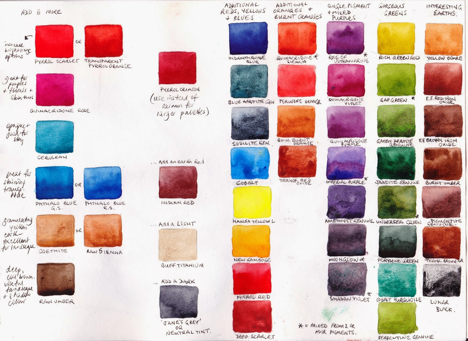
The next page shows my suggested next 6 colour additions to increase the colour range. These are Pyrrol crimson - a warm red, a Quinacridone Rose, an opaque Cerulean, a phthalo blue, a granulating earth yellow and a lovely deep raw Umber. With this set of 12 colours I would switch from Carmine to Pyrrol Crimson as the Quinacridone Rose covers the making purples role, or leave out Quinacridone Rose and keep Carmine.
I would then add Indian Red, so I can use an earth triad, and then perhaps a lovely light Buff Titanium and a dark.
Next are a whole lot of other wonderful Daniel Smith colours that are available to increase the palette. They are convenience mixtures to save time or special granulating colours that add and extra dimension to your work. I like to have some convenience colours so I don't spend all my time mixing while painting. Also I like to use only two or a maximum of three pigments in a mix if I can. Using a single pigment green, purple or orange can help with this. The mixtures are marked with an asterisk. All the others are single pigment colours.