Saturday 29 June 2013

Sydney Sketch Group


I joined the Sydney Sketch Group for the first time today, sketching at the Strand Arcade. That and the QVB are two of my favourite buildings in the city and it was a really nice way to spend a rainy Saturday.

We had a good turn up and it's lovely to see the very different way each person approaches such a massive challenge. I chose two small details rather than the whole building.

Both were painted in my favourite Moleskine watercolour sketchbook with a water-soluble graphite pencil and watercolours.

Tuesday 25 June 2013

Watercolour Comparisons 3 - primary red

Primary Red (and excellent Cool Red option)

I use four reds in my regular palette - a warm, a cool, an earth and a crimson for convenience. You can see all these colours and many other reds in my website here.

In a limited palette what you need is a red that will make oranges mixed with yellow AND purples mixed with blue. It's rather hard to find but the best options I have come across are either Quinacridone Rose (PV19, also called Permanent Rose and available in most brands), Quinacridone Red (also made with PV19), Quinacridone Magenta (PR122 available in a range of brands) or some of the crimsons, though they tend to make slightly more neutralised purples and oranges than the quinacridones. 

I'm going to focus on the Quinacridones first. To be really useful, you want to be able to wash the colour out to a pink, and both PV19 and PR122 will do that. Both will mix to make stunning purples, and both will mix to make lovely oranges and reds and even crimsons. So if you are looking for a primary triad, either Quin rose or Quin magenta will work fine along with the previously posted ultramarine and mid yellow. They will both also act as a cool red in an expanded palette, so a great starting colour if you are building up a palette of Artist grade colours.
One of my quinacridones pages - Rose, Pink and Magenta in a range of brands, painted in a Moleskine Watercolour book.
Rose Colours painted in a Stillman & Birn Beta book.
I tested a number of brands of PV19 and PR122 paints, as well as a couple of other cool red quinacridones. Quinacridone Red (DS) paints out beautifully, Schmincke Purple Magenta was my favourite of the PR122 version. Quinacridone Rose is lovely in most brands. Da Vinci also makes two versions - a Red Rose Deep (Quinacridone) and Permanent Rose (Quinacridone) using PV19 that are both very nice. (See left)
Quinacridone Rose, Red, Pink, Fuchsia and Magenta pigment swatches.
My favourite of the PR122 range was Purple Magenta, Schmincke, as it was nice and strong and painted out well. Below is the same pigment in Winsor and Newton. It's a great colour. The only downside for me is that I find the magenta colour less useful unmixed than a rose, which is why I ended up using Quin rose in my palette.

Notice how PR122 it makes lovely purples, strong crimsons and reds as well as gorgeous oranges. PV19 is very similar in use, the only difference being its strength making a crimson. If you have a crimson in your palette as well, as I do in an expanded palette, you can use either. Notice that the range of purples and oranges created are rather similar, so in a limited palette you only need the mid yellow and the Ultramarine, or you might go with a CYM palette and use a mid yellow, Quinacridone Magenta PR122 and Phthalo Blue GS.
Quinacridone Magenta PR122 mixed with Hansa Yellow Medium, New Gamboge, Quinacridone Gold, Ultramarine, Phthalo blue RS and Cerulean, painted in a Moleskine watercolour sketchbook.

Finally I would like to look at some Crimsons that can be used as a primary Red. I think of crimson as a convenience colour since it can be created by mixing a warm red or yellow with magenta, but it is a useful colour as well and as stated above, some versions are useful as a single red in a limited palette. Of all the ones I tested the best of these were Carmine by DS, Alizarin Crimson (Quinacridone) by Da Vinci and Permanent Alizarin by Winsor and Newton. I like these colours as they all wash out to a pink so will make clear purples. Not as clear as the PV19 or PR122, but pretty good! If you want a powerful crimson that is not used for making bright purples Pyrrol Crimson (DS) and Anthraquinoid Red (DS) are lovely. And for a mixed pigment version of a permanent Alizarin, the DS version is also lovely.

Crimson watercolour swatches.

And here is Carmine in a limited palette paint-out compared with Quinacridone Magenta.
Daniel Smith Hansa Yellow Light, Carmine and Ultramarine 
Notice the strength of the crimson colour in the top version, and the very strong reds and oranges. In the Schmincke triad with PR122 the purples are even more beautiful.

If you start with a mid yellow, Ultramarine Blue and a Quinacridone Rose/magenta/crimson, you can mix an amazing array of colours.

Add to these a warm red, a warm yellow and a cool blue and you expand the range tremendously, though I'd add Burnt Sienna first! That will be my next watercolour comparisons post...
Schmincke Pure Yellow, Purple Magenta and Ultramarine Finest

Next up - Burnt Sienna options

Watercolour Comparisons 1 - Ultramarine Blue here
Watercolour Comparisons 2 - mid yellows here
Watercolour Comparisons 3 - Primary Red here
Watercolour Comparisons 4 - Burnt Sienna here
Watercolour Comparisons 5 - Greens (Single Pigment, convenience mixes and special effect) here
Watercolour Comparisons 6 - Reds (Cool, mid and warm) here
Watercolour Comparisons 7 - Yellows (cool mid and warm) here
Watercolour Comparisons 8 - Blues here

New Paints - Acrylic!

I had a great opportunity to play with some soon-to-be-released acrylic paints last night at a meeting of the Lane Cove Art Society. The presenter, Jim Cobb, is the founder of Chroma Acrylics, who make a huge range of paints of a very high quality. We were able to compare Liquitex, Golden and others aside his Atelier range of paints and they compare very well.

Atelier Interactive paints have been around for a while. They are a lovely consistency and flow nicely off the brush. They have an interesting property in that they can be 'reactivated' by spraying the painting with water during the painting process, slowing down the drying time if required. Once the painting is finished it will dry quickly, unlike oils.

Atelier Interactive Acrylic
While these were interesting, what excited me was the Atelier Free Flow acrylics.
Atelier Free Flow acrylics
I don't do a lot of acrylic painting. I have used it for abstract paintings, expecially a series of 'splash' paintings on canvas (see here) but I haven't enjoyed using it for subject pantings - I prefer watercolour or oils. Something about the natural binder rather than an acrylic? Certainly I love watercolour for all the beauty of the actual pigments that get hidden in an oil of acrylic medium.

These acrylics were different though. They are rather like a thick pouring cream in consistency - they will 'blob' on the paper of canvas, but a spray of water dilutes them immediately and they react beautifully. They flow on the page in a manner that is very like watercolour.
My 'play' with Atelier Free Flow Acrylics. Cadmium Yellow, Yellow Orchre,  Red Gold, Burnt Sienna Natural, Ultramarine, Pyrrole Red, Quinacridone Magenta and Phthalo Blue.
You can see in my 'play' above that the granulation of the Ultramarine is even visible. You can also see the blob of Quinacridone Magenta on the page where I dropped the paint on, so they can be used thick or very thin.

So why am I interested? I have been using watercolour on canvas in order to be able to paint larger than a sheet of watercolour paper and not have to frame my work. I could stretch the paper over a canvas frame but that restricts the size. While I have had some success with this technique, the big problem is that the first wash goes on well, but subsequent washes remove the previous one so it is difficult to build up the layers of colour. Having a play with these paints was wonderful because I can see them working on canvas like a watercolour but without the problem of lifting off. They also wouldn't need to be sprayed with a UV vanish once the work was completed.

So a fun night. A range of 36 colours will be released (see here - Atelier Colour Range) and they are all made with excellent pigments. There is also a nice mix of opaque, transparent and semitransparent colours. I will be buying mostly the semi-transparent versions - Titanium White, Arylamide Yellow Light, Arylamide Yellow Deep, Pyrrole Red, Quinacridone Magenta, French Ultramarine, Phthalo Blue RS?, Yellow Ochre, Burnt Sienna Natural and Carbon Black. If I love them I may add a Phthalo Green, Indian Red and Raw Umber but I generally find I need less colours with oils or acrylics than I do with watercolour - partly as I do use black and white in oils and acrylics which makes a huge difference in mixing.

Thanks to Jim Cobb!


Wednesday 19 June 2013

Watercolour Comparisons 2 - mid yellows

Mid Yellows

I have added all the yellows to my website here.

It is common to have a few yellows in a palette. Traditionally, a cool and a warm yellow, an earth yellow and perhaps a reduced yellow such as Raw Umber. Some artists also add staining or non-staining options, or add an opaque range. I keep a cadmium deep and light in my studio for specific purposes but generally prefer transparent or at least semi-transparent watercolours.

I find I rarely need to use a cool, or green-biased yellow as I am rarely mixing the very bright greens it can make. For me, a good mid yellow that is neither cool nor warm i.e. neither orange-biased nor green-biased is a more useful option than the traditional cadmium or hansa yellow light. This works very well as the only yellow in a limited palette, but is also a nice building colour for an expanded palette.

Aureolin PY40 was the traditional mid-yellow choice, but is not recommended as it goes brown or grey or fades. Originally recommended as a watercolour, now known to be best avoided entirely.

So in my search for a better alternative I have tried a number of other yellows and my favourite is Hansa Yellow Medium by Daniel Smith. Other great choices are Daniel Smith's Quinaphthalone Yellow, Schmincke's Pure Yellow or M.Graham's Azo Yellow for a studio colour since it never really dries due to the honey mixed into the paint. As far as I can work out, all of these are ASTM II pigments, which is acceptable for watercolour.  Cadmium yellows are ASTM I but opaque. 

Here is my mid-yellows page.
Moleskine Watercolour Sketchbook showing mid yellows including Aureolin (fugitive), Cadmium Yellows and Hansa Yellow Medium.
These are the mid-yellows I tried. Once again I am searching for colours that re-wet well once dry in the palette, and single pigment colours. I didn't like the Mayan Yellow since it didn't paint smoothly. The Old Holland yellow is a gorgeous colour but, like many Old Holland colours, it dries with a sheen which is frustrating. Note - Winsor Yellow is also a good option, as is Blockx Primary Yellow.
Quinaphthalone Yellow Daniel Smith, Mayan Yellow Daniel Smith, Azo (quinacridone) M.Graham, Pure Yellow Schmincke, Hansa Yellow Mediun Daniel Smith, Cadmium Yellow Medium Hue Daniel Smith, Schev. Yellow Light Old Holland.


Hansa Yellow Medium or another mid-yellow makes a great triad with Ultramarine and a cool red such as Quinacridone Rose, Quinacridone Magenta or some crimsons - the subject of my next post.

In a larger palette, a warm yellow is convenient for increased mixing options. More on that in Watercolour Comparisons 7.

Watercolour Comparisons 1 - Ultramarine Blue here
Watercolour Comparisons 2 - mid yellows here
Watercolour Comparisons 3 - Primary Red here
Watercolour Comparisons 4 - Burnt Sienna here
Watercolour Comparisons 5 - Greens (Single Pigment, convenience mixes and special effect) here
Watercolour Comparisons 6 - Reds (Cool, mid and warm) here
Watercolour Comparisons 7 - Yellows (cool mid and warm) here
Watercolour Comparisons 8 - Blues here

Tuesday 18 June 2013

Watercolour Comparisons 1 Ultramarine Blue PB29.

Ultramarine Blue

In the large Moleskine watercolour sketchbook I did a comparison of every Daniel Smith watercolour, with pigment notes, reviews from other sources, mixing charts, colour wheels and so on. I also added comparisons with other brands of the same colour or the same pigment.

Here's my page on Ultramarine blue - my favourite blue. There is more information on my website here. You can also see a huge range of different blues painted out here.

Watercolour Notebook page on Ultramarine Blue showing Daniel Smith, M. Graham, Old Holland, Da Vinci and Schmincke finest.
Ultramarine Blue is my fist choice for a blue in any medium. It is a warm blue, i.e. it has a purple bias rather than a green bias, so will mix to make lovely purples. It will also make great greens, though not as bright as a cool blue would produce. It works as a single blue in a limited palette as it can be cooled with a touch of a cool yellow or phthalo green to create a cool blue.

In watercolour it will generally granulate which can be disconcerting to the beginner. The least granulating version I tested was Schmincke Ultramarine Finest. Here are my test samples, painted first as a graduated wash to see how the colour behaves in water and then as a 'juicy' wash.
French Ultramarine W&N, Ultramarine Da Vinci, Ultramarine M.Graham, Ultramarine Blue Deep Old Holland, Ultramarine Finest Schmincke, Ultramarine Daniel Smith, Permanent Blue Daler Rowney, French Ultramarine Daniel Smith.


Update 2015 - since writing this post I have updated my website with hundreds of watercolour swatches but I'll also include them here. My colour reproduction is not even close to perfect and these samples have been scanned at different times and with different scanners, but you can see that there is some range of hue within the PB29 pigment. Some brands have a 'light' and 'deep', some a Red Shade and a Green Shade, some a regular and a French version. The subtle differences in hue will have an effect in the sorts of greys and greens the colour mixes. In some brands there may be enough difference to want both versions but I have used D.S. Ultramarine rather than D.S. French Ultramarine and don't see any point in having both in this brand.

PB29 is such a reliable pigment that you really can't go wrong with it whatever brand you use. For me, working with watercolour that I squeeze out of a tube into a palette and allow to dry, the best options are Da Vinci and Daniel Smith as they both dry solid but rewet readily, they also mix the exact shade of grey I love with Burnt Sienna. I also have the Schmincke version in case I want a less granulating colour for sky effects.


Ultramarine mixes with a cool red to produce purples. Try it with Quinacridone Rose, Quinacridone Violet or Quinacridone Magenta for the most gorgeous bright purples.
Quinacridone Rose mixed with Ultramarine Blue and other bright purple mixes.

Ultramarine mixed with Quinacridone Violet and other purples.
 With a warm red it produces reduced or dull purples and even Indigo, brick red and Indian red hues.
Cadmium Red mixed with Ultramarine Blue and other neutralised purple mixes.


Mixed with a warm yellow it produces a range of useful olive or neutralised greens.
Ultramarine with warm yellows - Quinacridone Gold, Quinacridone Deep Gold and Cadmium Yellow Deep

Mixed with an orange or burnt orange or neutralised orange such as Burnt Sienna, Ultramarine creates a huge range of browns and greys. I love this combination!
Burnt Sienna mixed with Ultramarine Blue as well as Phthalo Blue and Cerulean
Ultramarine mixed with Quinacridone Sienna, Quinacridone Deep Gold, Quinacridone Gold and Burnt Umber.


It is also great mixed with Umbers and earth pigments.
Ultramarine mixed with Burnt Umber, Raw Umber and Indian Red


...So a really fabulous blue in your palette.

Coming up - mid yellows.

For more colour charts with Ultramarine and many other colours, see my website here.

Watercolour Comparisons 1 - Ultramarine Blue here
Watercolour Comparisons 2 - mid yellows here
Watercolour Comparisons 3 - Primary Red here
Watercolour Comparisons 4 - Burnt Sienna here
Watercolour Comparisons 5 - Greens (Single Pigment, convenience mixes and special effect) here
Watercolour Comparisons 6 - Reds (Cool, mid and warm) here
Watercolour Comparisons 7 - Yellows (cool mid and warm) here
Watercolour Comparisons 8 - Blues here


Watercolour comparisons - index

I plan to post my comparisons of various watercolour pigments and colours over the next few weeks under the title of 'watercolour comparisons'.

My plan is to start with colours suitable for a primary triad - Ultramarine,  Mid Yellows and then Primary Red options.  Next is Burnt Sienna, then greens, then other blues, yellows and reds, then other interesting earth colours and pigments, then darks and lights, then purples and oranges. If you are interested in any in particular I hope you'll let me know. I'll add a link here as I post them.

Watercolour Comparisons 1 - Ultramarine Blue here
Watercolour Comparisons 2 - mid yellows here
Watercolour Comparisons 3 - Primary Red here
Watercolour Comparisons 4 - Burnt Sienna here
Watercolour Comparisons 5 - Greens (Single Pigment, convenience mixes and special effect) here
Watercolour Comparisons 6 - Reds (Cool, mid and warm) here
Watercolour Comparisons 7 - Yellows (cool mid and warm) here
Watercolour Comparisons 8 - Blues here

Still to come...
Watercolour Comparisons 9 - Earth yellows
Watercolour Comparisons 10 - Earth oranges
Watercolour Comparisons 11- Earth reds
Watercolour Comparisons 12 - Blacks whites lights and darks
Watercolour Comparisons 13 - Purples
Watercolour Comparisons 14 - Oranges

Monday 17 June 2013

My Palette. Updated December 2015

I use a beautiful hand made brass paintbox made by John of Littlebrassbox for my regular studio palette of 20 colours. It contains a really useful selection of paints along with some great convenience mixes.

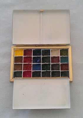
For travel I have two smaller portable brass palettes made by David of Classicpaintboxes. One is a lovely size to take with me for plein air painting and it holds 24 colours. (Pictured left).

The other is much smaller, still with 24 colours, and lives in my handbag all the time.

I also have a small travel palette with 16 colours.

Below is my travel palette, and how the colours are laid out. The 20 on the left are the same as my basic studio palette. The 4 extra colours on the right are colours I may choose to change around over time. These are all Daniel Smith, though other options are mentioned below.

My regular 20 colour 'studio' palette colours, plus the 4 'fun' extras in my 'plein air' palette.

Yellows.

I use 4 yellows, as you can see on the left column. The first is a transparent mid-yellow. I find limited use for a lemon yellow so am more interested in a mid-yellow that can go warm or cool and will make lovely oranges or greens. I am using Daniel Smith Hansa Yellow Medium (PY97) but I also liked Da Vinci Arylide Yellow Medium, Schmincke Pure Yellow (PY154), M.Graham Azo (Aureolin) Yellow (PY150) and Daniel Smith Quinaphthalone Yellow (PY138). Hansa Yellow Light (PY3) is an excellent alternative if you are looking for a cooler yellow, or Cadmium Yellow Light if you like an opaque cool yellow.

I use Quinacridone Gold (PO49) by Daniel Smith for my warm yellow. It is a little more neutral than other versions of a warm yellow and will double as a transparent earth yellow. It mixes with blues to create realistic greens and adds a lovely glow to washes. Other lovely brighter warm yellow options are New Gamboge (PY153) by Daniel Smith,  Gamboge Hue by Daler Rowney, Cadmium Yellow Deep Hue by Daler Rowney and Hansa Yellow Deep (PY65) by Da Vinci or Daniel Smith. If you like opaque colours you can't go wrong with Cadmium Yellow Deep from any manufacturer really. I am not so fond of cadmiums but keep a couple of pans in my studio for special purposes. For an even deeper orange-yellow try Permanent Yellow Deep.

For my earth yellow I use Goethite by Daniel Smith rather than the more usual Raw Sienna or Yellow Ochre. I love the colour but even better is the wonderful granulation. I have the other traditional colours in my studio - Yellow ochre (PY43) if I need a neutral opaque yellow, Mont Amiata Natural Sienna for a transparent version of a yellow ochre colour or Raw Sienna (PBr7) if I want a transparent warm earth yellow that doesn't make greens in a wash, or a basis for skin tones - but for most of my work, whether landscape, plants or buildings, Goethite is perfect.

My cool dark brown is Raw Umber (PBr7) by Daniel Smith, though Da Vinci is also excellent. This neutralised yellow should be a dark, cool colour made with PBr7, but in some brands it is closer to a yellow ochre so of little use. M.Graham also has a lovely version, though the M.Graham range has honey as an ingredient so will not set in a palette - best used in a studio rather than for plein air work.

Reds

I have chosen 4 reds, as you can see in the next column. I have opted for a red-orange and a rose to create a huge range of bright red and crimson mixes. I tried the versatile PR122 as a primary magenta, settling on Schmincke Purple Magenta for this colour, but I have reverted to the more useful Quinacridone Rose PV19 Daniel Smith for my cool red (Permanent Rose in many brands) as I find I need a pink more often than a magenta in my painting. Another alternative is a PV19 Quinacridone Red by Daniel Smith. The important function of a cool red is to make purples. A crimson alone won't usually work so well, with a few exceptions, so a rose is a good choice.

I tried a huge number of warm or scarlet reds from many brands and there are many excellent choices including Scarlet Lake or Winsor Red by Winsor & Newton, the gorgeous bright Pyrrol Scarlet by Daniel Smith, Permanent Red by Da Vinci, Schlev. Red Light by Old Holland and many cadmium reds if you like opaque colours, but I chose Transparent Pyrrol Orange by Daniel Smith for this colour. Going with an orange as my 'warm red' means I can create even more warm browns, but I can't create an Indian Red hue mixing with a cold blue as I would be able to do with a more red version such as Pyrrol Scarlet. That's not a problem in this palette as I have included Indian red. The other advantage is that this orange creates a perfect black with Phthalo Blue as well as a lovely range of other neutral greys along the way.
Note - in my teaching I use and recommend Pyrrol Scarlet as the warm red, rather than Transparent Pyrrol Orange. It is more versatile than my personal choice, and is featured in my book The Ultimate Mixing Palette: a World of Colours

Indian Red is my earth red. There are some other lovely options for this position in the palette too, including Venetian Red, or the Primatek Piemontite by Daniel Smith, but I like the depth of the Daniel Smith Indian Red. This is the place for PR101.

I experimented with the very powerful and deep Perylene Maroon PR179 as my fourth and deepest red. It is an earthy red in many ways and makes a wonderful triad with Indanthrone Blue and Quinacridone Gold, or another mixed black and grey range with Perylene Green. However, I don't like it alone and I'd rather have pigments in my palette that I love. I found it far more useful to have a strong crimson in the palette and mix the deeper hues as needed so have placed Pyrrol Crimson by Daniel Smith in this spot. Permanent Alizarin Crimson by Daniel Smith is a lovely alternative though it is a three-pigment mix. The same pigment is found in W&N Winsor Red Deep and Mission gold also make a crimson with PR264.

Blues

The third column has 4 blues starting with Phthalo Blue RS (PB15) which is a more mid-blue and a very beautiful colour for Australian skies. The usual choice for a cool blue in the palette is Phthalo Blue GS, which is a beautiful almost cyan colour - powerful and staining. I recommend Green Shade generally and use in my teaching, as it is cooler and more different from ultramarine

My next blue is Ultramarine (PB29) by Daniel Smith or use Da Vinci, or if you want less granulation, try Schimincke Ultramarine Finest. Schmicnke French Ultramarine was released in 2017 and is also lovely. This is a fabulous warm blue for mixing realistic greens, beautiful purples and great greys and browns. Some prefer Cobalt but I like the depth of Ultramarine. This is my favourite blue, and my choice for a single blue in a limited palette, though Phthalo Blue would also work.

Cerulean Blue Chromium (PB36) is my earth blue. I don't use many opaque or semi opaque colours but I do like this one by Daniel Smith. It has real body and granulation. I also liked Old Holland's Cerulean Blue Deep. A lovely alternative granulating green-blue option is Cobalt Turquoise (PB36) made by Daniel Smith and Winsor & Newton or Cobalt Turquoise Deep by Da Vinci.

Indanthrone Blue (PB60) Daniel Smith has different names from different manufacturers. It is a deeper blue than Ultramarine, and not an essential colour, but a gorgeous deep non-granulating blue that will mix with a warm yellow to make deep greens. It makes a wonderful powerful triad with Pyrrol Crimson and Quinacridone Gold. Mix with Quinacridone Gold to create a Perylene Green hue.

Greens

Many artists don't have greens in their palette but mix them all. This is great advice as it is important to know how to mix greens that will work in a painting, however I find having a basic green speeds up the mixing and painting process tremendously, especially when painting botanicals. In this 20 colour palette I find it useful to also include some convenience colours. Phthalo Green PG7 is made by most companies, though is called Winsor Green by W&N, and Blockx Green by Blockx. It is a powerful staining transparent colour. I don't use it alone but it mixes with a crimson colour to create black, a range of greys, deep greens and aubergines, and with a warm yellow creates lovely sap green hues. It will also make lovely purples with a quinacridone Rose, Magenta or Violet so it is a very useful mixer, and will mix with Phthalo Blue or cerulean if I need turquoise water colours.  Lovely alternatives are Viridian PG18 by Winsor & Newton, Da Vinci or Daniel Smith (though you may need to add a drop of glycerine or use fresh from the tube as this colour can be tricky to reactivate) or Jadeite (Daniel Smith) for a granulating treat that can double as a phthalo green and a perylene green. I use Jadeite in my more limited 16 colour travel palette.

My favourite green for Australian gum leaves and landscapes is a mixture of Ultramarine and Quinacridone Gold, and Daniel Smith Undersea Green is exactly that mix. It saves me time while painting to have this ready-made deep olive green.

The next green is Sap Green by Daniel Smith, which is a convenience mixture of Phthalo Green and Quinacridone Gold. I find this useful for many floral works as it is a realistic green. Green Apatite Genuine is another Daniel Smith Primatek colour that could be used in this spot (and I do in my 16-colour palette). It is a multitude of greens in one - a lovely grass green in a wash, a sap green in stronger dilutions and an earthy olive green in mass-tone. It is a more expensive option than Sap green but really wonderful.

Perylene Green can be mixed easily with Indanthrone Blue and Quinacridone Gold or a warm yellow, but I do a lot of landscapes and botanicals so enjoy this convenience colour. It is actually a black pigment PBk31 but I find is very useful. In my travel palette, I use Jadeite in place of Phthalo Green and Perylene Green since it is another very versatile granulating pigment.

Neutrals

I love Buff Titanium (Daniel Smith), though it is an unusual choice in a watercolour palette. It granulates beautifully and creates the perfect effect for beaches, rocks, sandstone and shells mixed with Goethite or other earth colours. I use is all the time.

Burnt Sienna PBr7 is my other favourite earth colours. It is a wonderfully useful colour to have for creating a range of browns and greys with Ultramarine and for skin tones. Some people prefer the brighter and less earthy versions made with PR101 such as the W&N Burnt Sienna (which is actually a hue), or even use Quinacridone Burnt Orange for the same orange earth position on the palette, but I'll stick with Burnt Sienna. I prefer Daniel Smith or the slightly more orange Da Vinci version. Transparent Red Oxide (Daniel Smith) is another great option for a brighter orange with even more granulation, though it is wild in a wash and less predictable. This is one of my favourite 'extra' pigments.

Burnt Umber PBr7 is another convenience colour as it can easily be mixed using Burnt Sienna and Ultramarine so I don't have it in my 16 colour travel palette, but I use it as my deep warm brown in my regular palette. It should be a deep warm brown and my preference is, once again, Da Vinci or Daniel Smith for this colour.

The final colour is a custom mix that I call Jane's Grey. I make it up in 60ml tubes every couple of months for myself and my students. It is a mixture of Daniel Smith Burnt Sienna and Ultramarine, in almost exactly equal amounts, stirred up well and allowed to dry. This saves so much time when painting as it is an instant dark that can be washed out for lovely soft greys for shadows or clouds. Others may prefer Payne's Grey, or Neutral Tint, but these usually have black in them which will look dull in a painting. Originally Payne's Grey was made without black. (See more here.) Jane's Grey is granulating and liftable and is my most used colour :-)

Extras

I have added four extra pigments to my basic 20 colour palette for my plein air palette and these are shown at the right. I have a large range of other gorgeous pigments and mixes in my studio but wanted to include a couple more in my palette, the first being Green Gold PY129 (called Rich Green Gold in Daniel Smith), which is an interesting yellow/olive that I find useful in landscape and floral work. This spot may some day get filled with Green Apatite Genuine, which, as mentioned above, is a gorgeous Daniel Smith green, or Serpentine Genuine, an alternative grassy green. (I have these two as extras in my tiny Pocket Palette :-)

The next colour down is a fun one. I don't often use it and it may not stay forever, but Cobalt Turquoise PB36 (Daniel Smith or Winsor and Newton) or Cobalt Turquoise Deep in Da Vinci is a gorgeous colour - granulating and interesting. Lovely with yellow for copper effects. I could change this to Cobalt Blue some time...or Raw Sienna.

Next down is Transparent Red Oxide (PR101), Daniel Smith, a granulating alternative to Burnt Sienna that I use to give the glow to sandstone and Australian landscapes. A great pair with this is Piemontite, as together they make wonderful rusty effects.

The final colour is a wonderful three-colour mix by Daniel Smith called Moonglow. Made with Ultramarine, Viridian and Anthraquinoid Red (a crimson), this is a gorgeous shadow violet colour that separates and granulates beautifully. It is lovely in florals and as a background colour for a range of subjects. 2016 - This has been changed to Piemontite.

Other favourite extras are Yellow Ochre (PY43) and Raw Sienna (PBr7). It is a fiddle to change colours in this palette so I don't do it often.

So that's my choice of colours for my palettes, but I keep many others in my studio just in case :-)

There are so many different pigments and mixtures available and every artist has to choose what suits them best for what they are painting.

2015 update - I have created a book 'The Ultimate Mixing Palette: a World of Colours' to show how 15 of these palette colours can be mixed to create almost any hue you might wish for. See the Ultimate Mixing Palette tab in my website for more information.


Thursday 6 June 2013

Testing watercolour - creating templates and test cards.

I mentioned I have tested a lot of watercolours.

In one book I have a paint-out of just about every Daniel Smith watercolour, with notes, pigment information, comparisons with other brands, mixing trials and so on. Another book has brief information on every paint I have tried recently arranged by colour. The third, and most useful for sharing comparisons, is a set of cards, one for each colour, that were pictured in a previous blog here. Others books contain test colour mixing...and so on.

I was asked how I set about making these cards so will share it here.

I used Cotman 190gsm paper since it is a little thinner than my usual 300gsm and I was making a large number of cards so I didn't want too much bulk. Note that it is best to test your colours on the paper you are using, or at least all on the same paper to compare results. The paper I used was from an A2 pad, which I ruled into rows all down the page, that is, lots of horizontal lines 4 inches apart. I then used my metal ruler, which happened to be 3cm wide, and a blade, to cut the paper into strips the width of the ruler.

So I had a load of strips 3cm wide with lines down them every 4 inches.

I hope you can picture that.

I then used a stencil to draw the rectangles and squares on them to paint in my watercolour washes. You do have to make sure your method doesn't confuse the front and back of the paper. If you cut them into cards before drawing on them they can flip around easily.

When you are doing a lot of repetitive work you need to find a few short cuts. Sometimes it is worth making my own stencil, sometimes it is worth just repositioning a bought one. I used a Mathomat - a rather wonderful thing I think with all sorts of lovely shapes - to draw the shapes on rather than measuring them up individually. You could of course do free-hand washes. Using the various edges to measure distances between the shapes, I drew on the rectangle at the bottom first, then the square, the the other rectangle above the square, then the two small squares at the bottom.

 
I drew the shapes to be painted in pencil and the other shapes in fine pen and wrote the colour name, manufacturer, pigment information and properties, according to the tube or website information, on the card. I then painted the cards, a wet graduating wash in the top square and a juicy wash in the rectangle. Once dry I cut them up and put a hole in them. 

You could also test how opaque they are by drawing a black line through the shapes with a permanent marker before painting them, or how staining they are by attempting to remove some of the colour once it is dry, but mine are about colour and granulation so I didn't do that.

Any other notes, such as whether the paint didn't re-wet well etc I wrote on the back. My original plan was to put them on a string or in a series of binder rings but at the moment these cards are arranged by colour in a tin for convenience.

Keeping a record of what you have tried is really helpful, what ever method you choose to use.

Sunday 2 June 2013

Boyd's Rocks - theme and variations

I went to Bundanon in 2011and painted a sketch of the rocks on the Shoalhaven River that Arthur Boyd painted over and over in so many ways. I had no desire to copy his style or techniques, especially since he was painting in oils where I am using watercolour, but have ended up creating a few large landscapes based on them.
Plein air sketch of Boyd's 'Rock Quartet', 2011.
It was incredibly peaceful sitting on the edge of the river. The water really was a deep gold as it reached the beach below me. Perfect colour - quinacridone gold.

The cliff behind was rather interesting, but I also loved the strong shadows against the light coloured rocks. I used Buff Titanium and bistre for them.
'Boyd's Rock Quartet, Shoalhaven River' 2012

I wanted to focus on the wonderful colour of the sky and the water in this painting. Australian skies are so often a lovely deep warm blue.


'Boyd's Rock Quartet II'  2012
In this one I wanted to really focus on the rocks and the line-work of the cliff. I had fun with a dagger brush for the linework. I really enjoyed using the granulating primate colours by Daniel Smith - Green Apatite Genuine and Serpentine Genuine. They are a whole range of colours in one. I have no problem mixing greens but I can't mix to create this level of granulation!

I did another of these - almost the same - as this one sold before I could exhibit it. And I tried it in acrylic too. I love painting rocks.

Testing Watercolours.


I have spent a lot of time in the last couple of months comparing watercolour paints made by a number of manufacturers. I have done a painted swatch of each one in a wash on damp paper and in a 'juicy' wash to see how they look nice and strong.
Painted samples of watercolours.
I tested them all from dried samples since that is how I use them in my palette, rather than straight from the tube. There are so many beautiful colours available that it can be difficult to choose the ones that are right for you, but I have made some adjustments to my palette as a consequence of my explorations, which I'll share shortly. I very much doubt that any two artists would choose the same palette but I think it is interesting to see what others do and why.

What I am looking for is a range of paints that re-wet well, that are permanent (i.e. rate I or II on the ASTM or equivalent), that look lovely in diluted washes or full strength, and that mix well with the other colours in my palette. I prefer transparent colours in general, but love the granulation that is possible with watercolours. While I prefer single pigment colours, there are some mixtures that are so useful that I buy them in a tube or make them myself.

Gum Leaves

I love painting leaves. They are always available and so interesting. My sketch books are full of them in many shapes and sizes. Here are some gum leaf sketches
A couple of gum leaves in my Moleskine sketch book.

More gum leaves, in my Moleskine pocket sketchbook.

 Like most objects, shadows help to make them seem real.

Urban Sketching

I joined the Sydney Urban Sketching group for a cold first-day-of-Winter sketching trip at Sydney University yesterday. It was really nice to be with an enthusiastic group of talented sketchers recording the beautiful sandstone buildings.
View through the archway into the main quad


I started inside the entrance to the main quad, thinking it may be a little sheltered but it was a bit of a wind tunnel.
Goethite (Daniel Smith) is a great colour for sandstone, and the granulation creates the stone texture with ease.

I then moved into the stone corridor and painted one of the many grotesques. (Not gargoyles my niece reminded me, since it doesn't spurt water.) They have great personality. I used a neutral grey watercolour pencil for the initial sketch, then my favourites Goethite and Bistre (see earlier posts - a mixed grey i this case made with Burnt Sienna and Ultramarine).

Out on the grass looking at the main building was such a daunting view that I picked up one of the many leaves blowing about and had fun with the wonderful range of textures and colours.

There were some wonderful sketches of the buildings, sculptures and fine details at the end of our 3 hours. What a great way to spend a Saturday morning.

A grotesque. 


Back to my real comfort zone of leaves, but love the colours!